

Beyond Blue: The Everglades Coastal Color Palette
|
|
Time to read 10 min
Cart
Your cart is empty
|
|
Time to read 10 min
When most people think of a coastal color palette, they picture blue water, white trim, and sandy beige. A summer trip to the Everglades reminded me how incomplete that picture really is.
I did not come home from the Everglades with the kind of images I usually turn into wall art. What I brought home instead was something just as valuable: a different understanding of coastal color. Not postcard color. Not bright beach-house blue. Something wilder, earthier, and more alive.
From Flamingo Lodge, the view looked almost unreal — pale bay water, acid-bright marsh, mangrove olive, soft cloud white, and a washed Florida sky that felt more vapor than blue. It was beautiful. It was also hot, intense, and nearly impossible to sit outside in for long. Mosquitoes and biting flies covered me almost as soon as I stepped out of the car. One of the most memorable moments came on a boardwalk trail, when I rounded a corner into the shade and was suddenly literally covered in mosquitoes.
That contrast stayed with me. The landscape was luminous, but it was not gentle. And maybe that is part of what made the colors feel so memorable.
Why the Everglades changed the way I think about a coastal color palette
Why summer in the Everglades feels so different from winter
The wild Florida colors that stood out most on this trip
What this palette can teach coastal interiors and biophilic design
Before this trip, I probably would have described a coastal palette the way many people do: blue, white, sand, sea glass, driftwood.
The Everglades expanded that idea.
This version of coastal color felt less polished and less expected. It was full of tannin water, mangrove shadow, marsh green, chalky mineral white, weathered bark, and haze-softened sky. It still felt coastal, but in a way that was quieter, stranger, and more grounded in ecosystem than in cliché.
That is part of why this trip stayed with me. It reminded me that a Florida color palette does not have to begin and end with ocean blue and sandy beige. The Everglades offered something wilder — tannin water, mangrove olive, marsh green, mineral white, and haze-softened sky. Wild Florida offers a version of coastal beauty that is more layered, more elemental, and more biophilic.
The dry season is the better time for birdwatching in the Everglades. Lower water levels concentrate wildlife, cooler weather makes the park easier to explore, and migration brings even more bird activity.
Summer felt very different.
It felt hotter, denser, quieter from a visitor’s perspective, and much more physically demanding. On our drive down to the Flamingo area, at the far southern end of the park, we passed only a car or two. Everything felt still and almost strangely empty.
One of the clearest reminders of how different summer felt came on a boardwalk trail, when I rounded a corner into the shade and was suddenly covered in mosquitoes.
I expected sweeping panoramic views of mangrove swamps and great shots of crocodiles and alligators stretched along the banks. Instead, the season changed what was visible. In many prairie areas, the water was simply gone after a very dry winter, and the wildlife I had imagined photographing was harder to find than I expected.
That quiet changed the trip. It made me pay more attention to atmosphere than spectacle.
I was not seeing the Everglades at their easiest or most visitor-friendly. I was seeing them in heat, shade, insect-thick air, and a harsher seasonal mood. And that may be why the colors felt so particular.
What stayed with me most was not one dramatic scene. It was the palette itself.
Some of the most memorable tones were the dark ones.
There was the blackened brown of still water, the tea-stained amber of shallows, the deep shadow around mangrove roots, and the dark reflections that made everything feel layered instead of flat. These are not the colors most people associate with coastal design, but they are absolutely part of the coast.
In interiors, tones like these can work as grounding colors — through darker woods, bronzed accents, warm black, or shadowed olive.
The Everglades greens were not one-note.
Some were soft and silvery. Others were sharp, sulfur-bright, or almost electric in the sun. Sawgrass, cypress, algae, marsh growth, and mangrove foliage all carried slightly different greens, which kept the landscape from ever feeling static.
That is one of the most interesting things about wild Florida color: it is layered. It does not rely on one signature green. It moves between olive, reed, chartreuse, moss, and gray-green depending on light and water.
For coastal interiors, this kind of green feels far more alive than a generic palm version.
The sky in the Everglades did not feel like bright tropical blue.
It felt softened by heat and distance — pale, vaporous, and washed with white. Even when the sky was clear, it felt muted by atmosphere. That gave the whole landscape a gentler range of blues and whites than the usual sharp coastal palette.
This is the kind of sky color that works beautifully indoors: not crisp nautical blue, but softer air-toned blue, mineral white, and clouded light.
What surprised me most was how layered the palette became up close — from grounding neutrals and living greens to the sharper accent colors that made the landscape feel wild rather than decorative.


Another thing I noticed was how much of the Everglades palette lives in neutrals.
Limestone, dried grasses, bark, sun-bleached wood, dock surfaces, and pale rock all contributed a whole range of chalky whites, weathered tans, bark browns, and muted straw tones. After such a dry winter, even the absence of water in some prairie areas became part of the palette — exposing more chalk, straw, dust, and weathered earth than I expected.
These colors gave the brighter greens and sky tones something to rest against. Weathered neutrals tell a different coastal story too — one shaped more by salt, sun, and wood than marsh and mangrove. I explore that quieter range in the Driftwood Coastal Color Palette.
That matters in rooms, too. A strong coastal color palette usually works best when it has real neutrals underneath it.
What surprised me most were the accent notes.
There were coppery insects, nearly black birds, yellow-green marsh flashes, and occasional hints of rusty orange or muted coral. These colors were not dominant, but they mattered. They made the palette feel wild instead of decorative.
That is a useful lesson for interiors: sometimes a room does not need more blue. Sometimes it needs one sharper, stranger accent to feel alive.
If you love exploring place-based coastal color palettes, browse more coastal color inspiration in our full coastal color palette hub.
The coast is not only beach and surf.
It is also bay, marsh, estuary, root, shadow, heat, reflection, and weather. The Everglades reminded me that coastal color can be murkier, softer, darker, and more layered than the version we usually decorate with.
That is part of why this palette feels so interesting to me. It still belongs to the coast, but it widens the story. It makes coastal design feel less themed and more connected to real place.
This kind of palette has real potential in a home.
A room inspired by the Everglades would not need to feel heavy or rustic. It could still feel refined. But it might pull from a different set of coastal colors:
For interiors, that shift feels more grounded and more biophilic. It reflects an actual ecosystem rather than a simplified beach-house formula.
That is one reason this palette fits so naturally with biophilic design. It is not just pretty. It is place-based. It comes from water, heat, shadow, plant life, mineral texture, and living systems working together.
To further explore coastal color palettes read 45 Coastal Color Palettes for Beach Homes: The Complete Ocean-Inspired Color Guide
Biophilic design is often discussed through shape, light, texture, and natural materials. But color matters too.
A truly biophilic palette does not need to be trendy. It needs to feel rooted in nature. The Everglades did that effortlessly. Its colors were not styled. They were ecological. They came from the actual conditions of the place — water level, season, heat, vegetation, shadow, and sky.
That is what makes the palette feel so compelling.
It is not a manufactured version of coastal calm. It is a wilder one.
Even the air plants growing from weathered trunks reinforced that feeling for me — not as decoration, but as another example of how the Everglades build beauty through living relationships, texture, and natural layering.
If you want the broader framework behind that idea, read Biophilic Design for Coastal Homes: Why Natural Forms Make a Room Feel Calm.
I did not come home from this trip with a finished piece of art.
I had imagined something else entirely — dramatic wildlife along the banks, panoramic mangrove views, maybe one of those images that announces itself immediately as a print. That was not what the Everglades gave me.
What they gave me instead was a broader sense of what coastal beauty can look like. Not every trip has to produce finished art immediately. Sometimes it changes your eye first.
The Everglades gave me a coastal color palette I would not have built from imagination alone. They gave me heat-softened blue, tannin shadow, marsh green, mineral white, weathered brown, and the reminder that the coast is much bigger — and stranger — than one visual formula.
That alone made the trip worth taking.
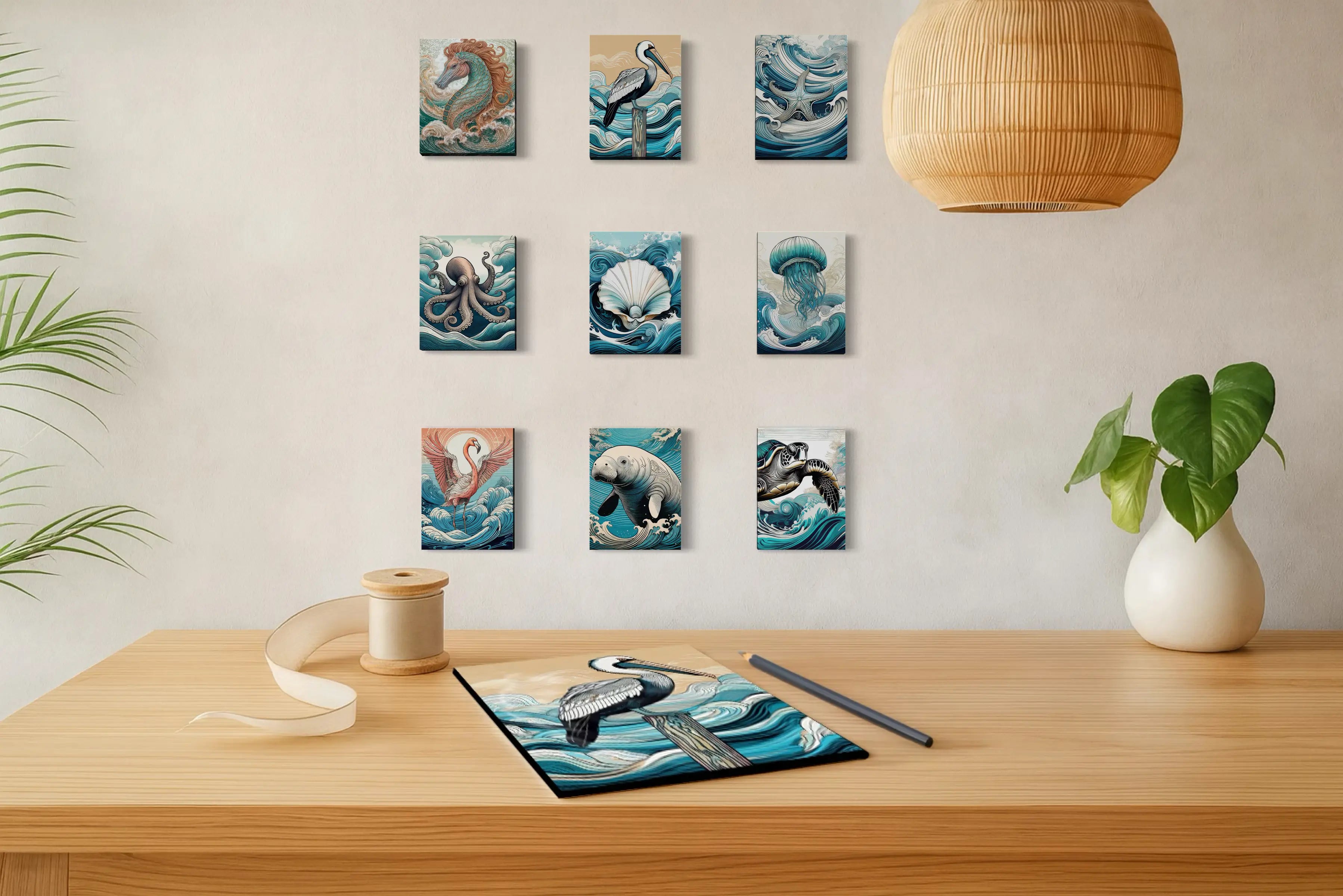
Explore glass prints that carry the same layered coastal mood through real glass, light, reflection, and natural color.
A coastal color palette is a group of colors inspired by the shoreline and nearby environments. While many people think first of blue, white, and sand, coastal color can also include marsh green, weathered wood, shadow, mineral white, and tannin water.
The Everglades expand coastal color beyond soft beach tones. They introduce darker water, layered greens, bark browns, chalky neutrals, haze-softened sky, and more ecological contrast.
Yes. It is a wilder version of coastal color, shaped by bay water, marsh, mangroves, estuary light, and heat rather than by open beach alone.
Yes. It can make coastal interiors feel more grounded, more original, and more biophilic by replacing cliché beach colors with tones drawn from a real ecosystem.
Because it comes directly from nature. Its colors reflect living systems, water, weather, vegetation, shadow, and natural variation rather than a purely decorative idea of coastal style.
About the Author — Lisa Reid
Lisa Reid is the artist and founder behind Echoes of the Sea LLC, where coastal art is shaped by shoreline light, natural form, and the changing atmosphere of place. Through her glass wall art and The Coastal Journal, she explores how coastal color, biophilic design, shells, botanicals, and field experience can help create homes that feel calmer, more grounded, and more connected to nature.


