

Driftwood Beach Color Palette for Coastal Interiors
|
|
Time to read 6 min
Cart
Your cart is empty
|
|
Time to read 6 min
Driftwood beach color palettes capture the quiet beauty of weathered shorelines — where pale sand, sun-bleached wood, and soft ocean mist create a landscape of calm coastal neutrals.
These tones are shaped by time and tide. Driftwood slowly softens in the salt air, sand lightens beneath the sun, and the horizon blends into gentle blues and grays. Together, these natural colors form a palette that feels relaxed, organic, and deeply connected to the rhythm of the coast.
Jekyll Island’s famous Driftwood Beach was once part of a coastal maritime forest. Over decades, shifting shorelines, storms, and rising tides slowly reshaped the landscape. As the ocean advanced, ancient trees were exposed and weathered by salt, wind, and sun, leaving behind the sculptural driftwood forms that now define the shoreline.
In coastal interior design, driftwood palettes create spaces that feel grounded and serene. Instead of relying on bright nautical colors, these interiors use subtle tonal layers — warm sands, weathered woods, and soft ocean blues — to evoke the quiet atmosphere of a windswept beach.
What is a Driftwood Beach Color Palette?
A driftwood beach color palette is a coastal interior design palette inspired by weathered shoreline landscapes. It typically combines pale sand neutrals, sun-bleached wood tones, soft gray-beige driftwood hues, and muted ocean blues that reflect tidepools and distant coastal horizons.
The result is a palette that feels natural, relaxed, and well suited for calm beach house interiors.
These ocean-inspired tones are part of a larger collection of shoreline palettes explored in our Coastal Color Palette Guide, where we introduce several core palette themes inspired by beaches, tidepools, and coastal landscapes.
Pair these driftwood tones with curated wall art arrangements in our Gallery Wall Ideas.
The Driftwood Beach palette blends warm coastal neutrals with soft ocean tones inspired by the shoreline landscapes of Jekyll Island.
This palette includes:
Together these tones create a palette that feels calm, layered, and naturally coastal.
Driftwood beaches are shaped by the meeting of land and sea.
Over time, fallen trees and shoreline branches are sculpted by saltwater, wind, and sun. The result is wood that fades into soft gray, pale taupe, and sandy beige tones that blend naturally with the surrounding beach.
These weathered textures sit against a backdrop of gentle coastal blues — the quiet colors of tidepools, distant water, and sea mist drifting across the horizon.
These muted blues often echo across other shoreline palettes — from the translucent aquas of sea glass to the soft ocean greens explored in our Sea Turtle Color Palette for Coastal Interiors, both inspired by the shifting colors of shallow coastal waters and marine habitats.
Because these colors exist together in nature, they translate beautifully into interior design. Driftwood palettes feel harmonious and balanced, echoing the organic tones found along the shoreline.
Driftwood palettes work best when paired with natural materials and soft textures.
Rather than strong color contrast, these interiors focus on subtle layering — allowing different shades of sand, wood, and ocean blue to blend naturally throughout a space.
Common design elements include:
Artwork often becomes the focal point within this palette, introducing slightly richer ocean tones while maintaining the calm atmosphere of the space.
Glass wall art works especially well in driftwood interiors because reflective surfaces interact with natural light, echoing the movement and luminosity of coastal water.
Driftwood color palettes adapt easily across many spaces within a coastal home.
In living spaces, driftwood tones create a relaxed foundation for layered textures. Neutral sofas, natural wood furniture, and ocean-inspired artwork help anchor the palette while maintaining an airy coastal atmosphere. You can explore more ideas in our Coastal Living Room Design Guide.
Bedrooms benefit from the softness of driftwood palettes. Pale sand tones, weathered wood textures, and gentle ocean blues create restful spaces that feel calm and grounded. See more inspiration in our Coastal Bedroom Design Guide.
Bathrooms are another natural setting for driftwood palettes. When paired with pale aquas or misty blues, driftwood tones create spa-like environments that echo the quiet colors of tidepools and shoreline fog. Discover more styling ideas in our Coastal Bathroom Design Guide.
Driftwood beaches often feel timeless.
They remind us that the shoreline is constantly shaped by wind, tide, and time. The colors of driftwood carry that same quiet story — weathered wood, softened sand, and the pale blues of open water.
Bringing these tones into interior design creates spaces that feel calm, natural, and connected to the living coast.
You can explore the full collection in our 45 Coastal Color Palettes for Beach House Interiors, where we share dozens of ocean-inspired palettes drawn from marine life, shoreline landscapes, and coastal environments.
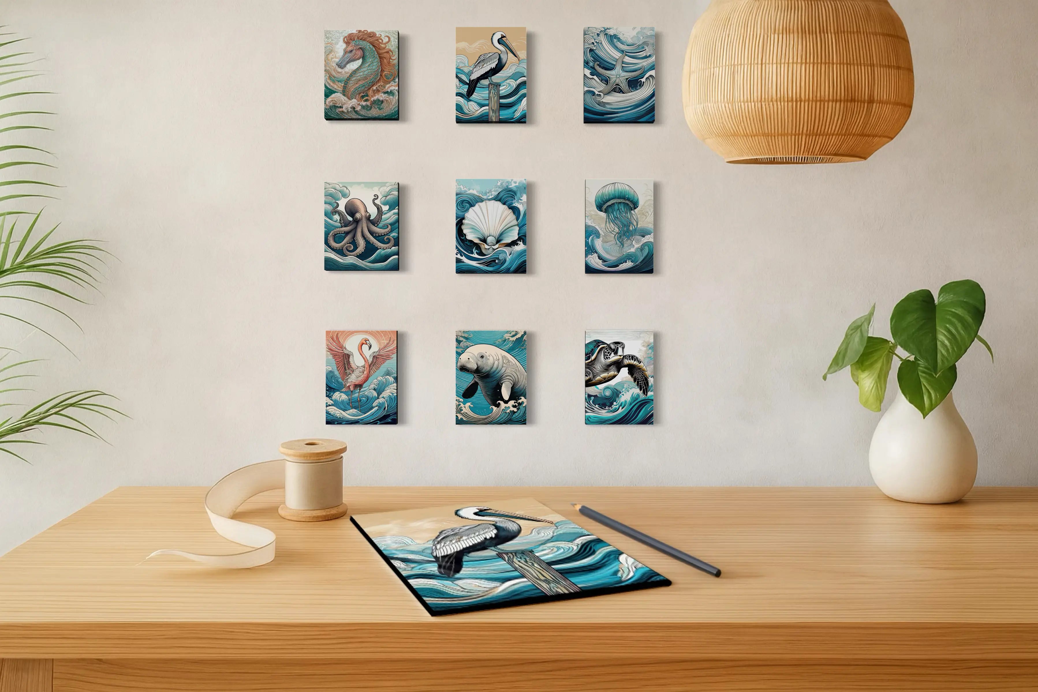
Ocean-inspired artwork is one of the easiest ways to introduce driftwood tones into a room while creating a natural focal point within calm coastal interiors.
Glass wall art reflects light in subtle ways that echo the shimmer of water and the pale glow of coastal skies. When paired with driftwood palettes, these pieces add depth while maintaining the serene character of the space.
Explore ocean-inspired artwork designed to complement soft sands, weathered wood tones, and gentle coastal blues.
Pelican Palette
Coastal Sunset Palette
A driftwood beach color palette typically includes soft coastal neutrals such as pale sand, weathered gray-beige wood tones, muted taupes, and gentle ocean blues inspired by tidepools and coastal mist. These tones reflect the natural colors of weathered shoreline landscapes.
Yes. Driftwood palettes work especially well in coastal homes because their muted neutrals and soft ocean tones create calm, layered interiors that feel natural rather than decorative. They pair beautifully with natural materials such as linen, rattan, driftwood, and light oak furniture.
Driftwood palettes are versatile and work well in living rooms, bedrooms, and bathrooms. Their soft neutral tones create a relaxing atmosphere in bedrooms, while subtle ocean blues and natural wood textures help anchor living spaces and spa-like coastal bathrooms.
Driftwood palettes focus more on warm coastal neutrals and weathered wood tones, while sea glass palettes emphasize translucent aquas, soft seafoam greens, and lighter ocean blues inspired by polished ocean glass.
Natural textures complement driftwood palettes best. Common materials include linen textiles, light oak or driftwood furniture, woven fibers such as jute or rattan, ceramic accents, and ocean-inspired artwork that introduces subtle blue tones.
Author's Note
Lisa Reid is the founder and artist behind Echoes of the Sea LLC, a coastal studio dedicated to capturing the light, rhythm, and natural beauty of ocean landscapes.
Her work blends photography, coastal symbolism, and interior design to create glass wall art that reflects the atmosphere of the shoreline. Through Echoes of the Sea, Lisa explores how color, texture, and natural inspiration can transform everyday spaces into calm coastal sanctuaries.


