

45 Coastal Color Palettes for Beach Homes: The Complete Ocean-Inspired Color Guide
|
|
Time to read 13 min
Cart
Your cart is empty
|
|
Time to read 13 min
This coastal color ecosystem map shows how marine life, landscapes, and ocean water contribute to coastal color palettes
What is a coastal color palette?
A coastal color palette is a collection of colors inspired by ocean environments such as seafoam greens, sandy neutrals, ocean blues, and sun-washed whites. These palettes are widely used in beach homes and coastal interior design because they create spaces that feel calm, light-filled, and naturally connected to the shoreline.
This guide explores 45 curated coastal color palettes inspired by marine life, coastal landscapes, shells, and ocean light.
The ocean has long inspired artists, designers, and homeowners with its calming palette of blues, sands, sun-washed neutrals, and organic textures. From the soft blush tones of seashells to the deep navy of open water, coastal environments offer an extraordinary range of color inspiration.
At Echoes of the Sea LLC, coastal color is about more than simply choosing shades of blue. It’s about capturing the atmosphere of the shoreline — the light, the wildlife, the shifting tides, and the natural textures that define life near the water.
To celebrate that inspiration, this guide brings together 45 curated coastal color palettes, each drawn from a different aspect of the coastal world. Some palettes reflect marine life, while others are inspired by beach landscapes, ocean water, coastal birds, or interior design styles.
Together, they form a comprehensive coastal color palette system for beach homes and coastal interiors, which can be used for:
If you love coastal design, you may want to bookmark this guide or save it for future inspiration as you explore the palettes below.
Designers and homeowners often use coastal color palettes to create calm, light-filled interiors inspired by the sea.
Table of contents
One of the reasons coastal color palettes remain so popular in interior design is their ability to create spaces that feel naturally calm and restorative.
Many of the colors found along the shoreline — soft blues, seafoam greens, sandy neutrals, and sun-washed whites — occur in environments that humans instinctively associate with relaxation.
It is no coincidence that many people feel most at peace near the ocean. The colors of the sea and sky create a visual harmony that designers often try to recreate inside the home.
Coastal palettes tend to balance three essential elements:
When these elements are combined thoughtfully, they create interiors that feel open, airy, and deeply connected to nature.
This is why coastal color schemes work so beautifully in beach homes, vacation properties, and everyday interiors that seek a sense of calm.
Before diving into the palettes themselves, it helps to understand what truly defines a coastal color palette.
Many people assume coastal design simply means shades of blue and white. While those colors certainly appear often, authentic coastal color schemes are inspired by a much broader natural environment.
When you spend time along the shoreline, you start to notice that coastal colors tend to come from a few repeating sources.
The ocean itself provides an incredible spectrum of blues and greens — from soft seafoam tones near shore to deep navy waters farther out at sea.
Creatures like sea turtles, dolphins, jellyfish, coral reefs, and octopus introduce unexpected accents of color including soft corals, muted greens, silvery grays, and delicate pastels.
Beaches, dunes, driftwood, sea oats, coastal wetlands, and tidepools create the grounding neutral tones that balance brighter ocean colors.
For a wilder, more place-based take on coastal color, see my Everglades Coastal Color Palette.
Modern coastal interiors, Japandi coastal spaces, coastal farmhouse homes, and relaxed boho beach interiors all interpret these natural colors differently.
At Echoes of the Sea, these influences were studied and translated into a series of curated palettes that reflect the visual rhythm of coastal ecosystems.
If you're exploring ocean-inspired interiors, you can also browse our Coastal Color Palette Guide, where we organize coastal palettes by mood, style, and interior design inspiration.
Coastal color inspiration often follows patterns found in nature. One way to visualize this relationship is through the Coastal Color Spiral, inspired by the natural geometry of the nautilus shell.
As the spiral expands outward, it reflects how coastal colors emerge from different ocean environments — from marine life and shoreline textures to expansive ocean waters and coastal skies.
This visual framework reminds us that coastal palettes are rarely random. They evolve naturally from the ecosystems that surround the sea.
The ocean is not a single environment — it is a network of interconnected coastal ecosystems.
The Coastal Color Ecosystem Map organizes the palettes in this guide according to the natural environments that inspired them.
Rather than viewing colors as isolated swatches, the map connects them to the places where they originate.
For example:
By organizing palettes this way, the guide makes it easier to see how coastal colors can work together naturally within interior spaces.
The ocean offers an incredible variety of color inspiration. From marine life and coastal birds to beach landscapes and interior design styles, the palettes below explore the many ways coastal color appears in nature and design.
From marine life and coastal birds to beach landscapes and interior design styles, the palettes below explore the many ways coastal color appears in nature and design.
Each palette reflects a different coastal environment and can be used for decorating inspiration, design projects, or mood boards.
Interior designers often interpret coastal colors through distinct decorating styles.
These palettes translate natural coastal color inspiration into recognizable interior aesthetics.
You can explore these design approaches in more depth in our Coastal Style Guide, where we break down the most popular coastal decorating styles.
Soft neutrals, warm wood tones, ocean blues, and grounding charcoal accents define the Coastal Japandi palette. This style blends Scandinavian minimalism with Japanese serenity, using natural textures and restrained contrast to create interiors that feel calm, balanced, and deeply connected to nature.
Why this palette works
Where to use it
Living rooms, bedrooms, and minimalist coastal homes.
You can explore the full design philosophy behind this style in our Coastal Japandi Design Guide.
Modern coastal interiors emphasize clean architecture, open light, and simple color palettes inspired by sea and sky.
This palette typically includes soft whites, pale woods, airy blues, and ocean-inspired neutrals.
Why this palette works
Where to use it
Living rooms, open-concept homes, and modern beach houses.
Luxury coastal interiors interpret seaside colors through elegant materials and refined contrasts.
Deep ocean blues, warm neutrals, and subtle metallic accents create a sophisticated seaside atmosphere.
Why this palette works
Where to use it
Luxury beach homes, primary bedrooms, and formal living spaces.
You can explore this aesthetic further in our Coastal Luxury Style Guide.
Coastal farmhouse style blends rustic textures with relaxed beach tones.
Weathered wood, sandy neutrals, and classic coastal blues create a welcoming and comfortable environment.
Why this palette works
Where to use it
Family rooms, kitchens, and casual coastal homes.
Learn more about decorating with this aesthetic in our Coastal Farmhouse Style Guide.
Inspired by nostalgic seaside cottages, coastal grandma interiors feature warm whites, gentle pastels, and classic coastal textures.
The palette feels timeless, comfortable, and quietly elegant.
Why this palette works
Where to use it
Reading rooms, bedrooms, and traditional coastal homes.
Learn more about this aesthetic in our Coastal Grandma Style Guide.
Boho coastal design combines beach neutrals with earthy textures and relaxed artistic accents.
Soft sands, muted ocean tones, and natural materials create an effortless layered style.
Why this palette works
Where to use it
Creative spaces, relaxed living rooms, and artistic interiors.
Explore the evolution of this palette in our Boho Coastal Color Trends for 2026.
Moody coastal interiors offer a dramatic interpretation of seaside design.
Deep navy blues, charcoal tones, and stormy ocean hues create spaces that feel rich, atmospheric, and sophisticated.
Why this palette works
Where to use it
Dining rooms, libraries, and dramatic living spaces.
See our Moody Coastal Style Guide for more inspiration.
The sky and atmosphere above the ocean produce some of the most beautiful color moments along the coast.
Ocean Mist
Soft gray-blue tones capture the hazy stillness of early morning along the shoreline.
Coastal Sunset
Warm coral, peach, and golden hues reflect the glowing light of the sun setting over the ocean.
Coastal Fog
Muted grays and pale blues echo the soft atmospheric colors of misty coastal mornings.
Coastal Salt Air
Crisp sky blues and airy whites reflect the brightness and freshness of ocean breezes.
The ocean itself provides endless color inspiration.
Seafoam
Light aqua greens and gentle coastal blues mirror waves rolling onto bright sandy beaches.
Sea Glass
Muted aquas and weathered turquoise tones echo the frosted colors of ocean-tumbled glass
You can explore this palette in more detail in our Sea Glass Color Palette Guide for Coastal Interiors.
The shoreline reveals some of the most delicate coastal colors.
Coral Palettes (2 variations)
Inspired by both the vibrant colors of living coral reefs and the softer tones of sun-washed coral fragments.
Shell Palettes (2 variations)
Soft blush pinks, ivory whites, and sandy neutrals reflect the delicate colors of seashell collections.
Sea Urchin Palettes (2 variations)
Muted purples, soft blues, and coastal neutrals inspired by the subtle colors of tidepool creatures.
Starfish
Warm sand tones paired with coral accents and ocean blues inspired by shoreline tidepools.
Sand Dollar
Soft ivory, pale sage greens, and natural beach neutrals inspired by the iconic sand dollar shell.
Tidepool
A colorful mix of ocean greens, coral tones, and shell hues found in shallow coastal pools.
Nautilus
Graceful shell pinks, sandy neutrals, and ocean blues inspired by the spiral geometry of the nautilus shell.
The nautilus shell has long fascinated artists and designers because of its natural spiral geometry. The spiral is inspired by the nautilus shell — one of nature’s most elegant geometric forms and a symbol often associated with ocean-inspired design. You can explore more about this fascinating natural form in our Nautilus Symbolism and Ocean Design Guide.
Birds that inhabit the shoreline introduce striking color contrasts.
Great Blue Heron
Slate blues, burnished golds and soft shoreline neutrals inspired by the graceful colors of this coastal bird.
Flamingo
Blush pinks, coral tones, and tropical accents reflecting the vibrant colors of flamingos.
Pelican
Warm grays, sandy neutrals, and coastal blues inspired by pelicans along the shoreline.
Coastal birds bring striking color contrasts to shoreline environments, from the slate blues of great blue herons to the tropical blush tones of flamingos.


Beaches and wetlands offer some of the most versatile coastal inspiration
Lagoon
Turquoise water tones and lush greens inspired by calm tropical lagoons.
Bayou
Deep greens, earthy browns, and muted water blues reflecting coastal wetlands.
Florida Springs
Bright aquamarine waters paired with vibrant natural greens inspired by crystal-clear springs.
Dune Grasses
Soft sandy neutrals and sage greens inspired by windswept coastal grasses.
Sea Oats
Golden wheat tones reflecting the iconic grasses that line coastal dunes.
Driftwood Beach
Weathered gray wood tones and beach neutrals inspired by sun-bleached driftwood.
Emerald Coast
Vibrant turquoise waters and brilliant white sand inspired by Florida’s Gulf Coast beaches.
Mangrove Swamp
Earthy greens and dark water tones inspired by mangrove forests and coastal estuaries.
Marine animals introduce some of the most captivating coastal color combinations.
Sea Turtle
These palettes range from soft lagoon greens to deeper marine blues inspired by sea turtle habitats.
See the full breakdown in our Sea Turtle Color Palette Guide for Coastal Interiors.
Octopus Palettes (2 variations)
Copper tones and deep ocean blues reflect the dramatic environments where octopus live.
Jellyfish Palettes (2 variations)
Translucent pastels and ocean blues inspired by drifting jellyfish and luminous ocean waters.
Seahorse
Warm golden tones paired with seagrass greens inspired by delicate seahorse habitats.
Dolphin
Silvery blues and soft coastal grays inspired by dolphins moving through open water.
Whale
Deep navy blues and powerful ocean tones inspired by the vast waters where whales travel.
Manatee
Soft coastal greens and warm neutrals inspired by the calm waters where manatees live.
Coastal palettes can be used throughout a home to create spaces that feel calm, airy, and connected to nature.
Interior designers often use these palettes in:
You can also incorporate coastal color through:
Natural light plays a major role in how coastal colors appear inside a room. Sunlit spaces can support deeper blues and contrast, while shaded rooms often benefit from softer tones like seafoam, sand, or driftwood gray.
Pair these tones with curated wall art arrangements in our Gallery Wall Ideas.
Choosing a palette depends on the mood you want to create.
Light and Airy Spaces
Use seafoam, soft blues, and sandy neutrals.
Relaxed Beach Cottage Style
Look for palettes inspired by shells, dunes, and coastal grasses.
Sophisticated Coastal Interiors
Combine navy tones with warm neutral foundations.
Tropical Coastal Homes
Introduce coral, turquoise, and vibrant ocean hues.
When layered thoughtfully, coastal colors create interiors that feel timeless and naturally connected to the sea.
With so many palettes inspired by the ocean, it can be helpful to quickly browse the full collection.
Below is an index of the palette categories included in this guide. This index makes it easy to revisit palettes while planning decorating projects or creating coastal mood boards.
Coastal Color Palette Index
Coastal palettes typically include ocean blues, seafoam greens, sandy neutrals, shell pinks, and weathered driftwood tones.
Sea glass and seafoam palettes remain among the most popular because they create calm, airy interiors.
Start with neutral tones like sand and driftwood, then add ocean blues or shell-inspired accent colors.
No. Many coastal palettes focus on neutral tones like ivory, sand, shell pink, and driftwood gray.
If you enjoy exploring coastal design ideas, you can also browse the Echoes of the Sea Coastal Journal, where we share inspiration on coastal interiors, ocean symbolism, and seaside living.
The ocean offers one of the richest sources of color inspiration in the natural world.
From quiet misty mornings to vibrant tropical reefs, coastal environments provide endless combinations of tones, textures, and moods.
The 45 palettes in this guide represent just a glimpse of that inspiration — each one drawn from the colors of marine life, coastal landscapes, and the ever-changing light of the shoreline.
Whether you are decorating a beach house, planning a coastal interior, or simply collecting ideas for future projects, these palettes can serve as a starting point for your own creative exploration.
At Echoes of the Sea, the beauty of the ocean continues to inspire new ideas — and new colors — waiting to be discovered.
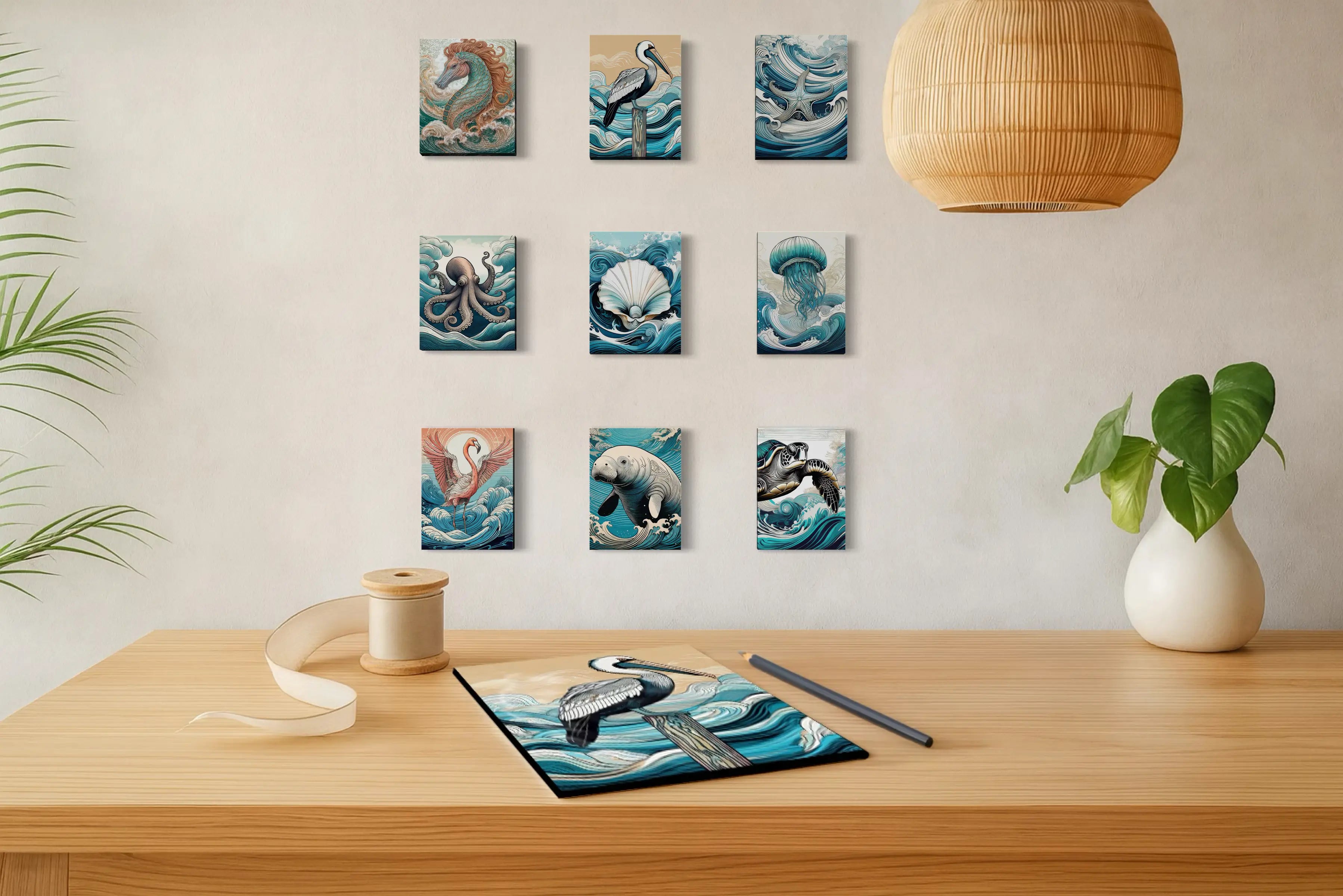
If these palettes sparked ideas for your own space, you can explore our coastal glass wall art collection — designed to bring the colors and atmosphere of the shoreline into your home.
You may also want to save this guide for future inspiration as you plan coastal interiors, mood boards, or decorating projects.
About the Author
Lisa Reid is the photographer and artist behind Echoes of the Sea LLC, where coastal photography and glass wall art are designed to capture the light, color, and atmosphere of the shoreline.
Inspired by years spent exploring beaches, tidepools, and coastal landscapes, her work blends ocean imagery with thoughtful design to bring a sense of calm and connection to coastal homes.


