

Sea Turtle Color Palette for Coastal Interiors | Soft Seafoam & Deep Ocean Tones
|
|
Time to read 6 min
Cart
Your cart is empty
|
|
Time to read 6 min
A sea turtle color palette draws its inspiration less from one animal than from the waters a sea turtle moves through. There are the pale seafoam greens of the shallows, sand warmed beneath clear water, muted seagrass, flashes of coral, and the deeper teal and blue that begin where the coastline falls away.
I love this palette because it holds two moods at once. Near shore, the colors are quiet and luminous; farther out, they become deeper and more powerful. Used together in a coastal interior, those soft seafoam tones, sandy neutrals, and marine blues can create a room that feels layered and alive without becoming brightly tropical or overtly nautical.
The result is a sea turtle color palette inspired by habitat, movement, and the changing depth of the ocean—a softer way to bring the living coast indoors.
Designers often use sea turtle palettes in modern coastal homes where soft ocean colors provide a natural foundation for artwork and layered textures.
Pair these Sea Turtle color tones with curated wall art arrangements in our Gallery Wall Ideas.
I think of sea turtle color in three layers: the pale world near shore, the greens and shell tones of coastal habitat, and the deeper blues beyond it. Each palette comes from a different part of the turtle’s environment, but together they tell the same story of water, movement, shelter, and return.
Seafoam greens, ocean haze, sandy neutrals, and soft shell whites create a palette that feels light and tranquil. This version of the sea turtle palette works beautifully in spa-like bathrooms, restful bedrooms, and minimalist coastal interiors.
The colors flow gently from one tone to another, mirroring the way shallow coastal water shifts between sand, sea grass, and sky.
This palette leans into the quieter greens of the living coast—sage, seaweed, shell cream, weathered driftwood, and deep sea blue. It feels a little earthier than the soft seafoam palette, carrying the colors of seagrass beds, worn shell, coastal wood, and the deeper water beyond.
I love this version because it feels grounded without losing the ocean. The greens soften the palette, shell cream brings in light, and Deep Sea gives the room enough contrast to keep everything from drifting too pale.
Deeper marine tones — teal, ocean navy, and marine blue — reflect the richer colors of offshore waters. These hues introduce contrast and visual depth while still maintaining the calming atmosphere associated with coastal design.
This palette works especially well when stronger color moments are needed in a room, such as statement artwork, accent textiles, or deeper feature walls.
You can explore more ocean-inspired combinations in our Coastal Color Palette Guide, where we share additional palettes inspired by the shoreline.
Sea turtles move through very different worlds over the course of their lives—coastal shallows, seagrass beds, reefs, and open ocean. The colors change with them. Pale green water gives way to teal and marine blue; sand and shell neutrals appear near shore; darker currents bring in the depth that keeps the palette from feeling overly delicate.
That natural transition is what makes these colors work so beautifully together indoors. They do not feel like separate swatches chosen to match. They feel connected by water.
These tones often overlap with other shoreline-inspired palettes such as sea glass blues and aquas, which capture the soft translucence of ocean water shaped by light and movement.
You can explore those lighter ocean hues in our Sea Glass Color Palette for Coastal Interiors guide.
Deep ocean palettes, by contrast, introduce richer marine tones that add contrast and depth while still maintaining a calm coastal atmosphere.
Sea turtle palettes work best when paired with natural materials and layered textures.
Instead of applying color heavily, coastal interiors typically introduce these tones gradually through textiles, furniture, and artwork.
Common elements include:
These materials echo the textures of the shoreline while allowing the palette to feel organic rather than decorative.
Glass artwork can be especially effective because reflective surfaces interact with natural light in ways that mirror the movement and luminosity of water.
Sea turtle color palettes adapt easily to different rooms throughout a coastal home.
Deep ocean tones work beautifully in living spaces where artwork or accent pieces can introduce stronger color contrast and visual depth. Explore more ideas in our Coastal Living Room Design Guide.
Soft sea turtle palettes create calm bedrooms that feel airy and restorative. Seafoam greens, shell whites, and soft ocean blues reflect the quiet tones of shallow coastal water and help establish a peaceful atmosphere ideal for rest.
Because bedrooms benefit from gentle color transitions rather than strong contrast, sea turtle palettes are especially effective for coastal bedroom design. Layering soft seafoam textiles, light wood furniture, and ocean-inspired wall art allows the space to feel calm and naturally connected to the shoreline.
See additional inspiration in our Coastal Bedroom Design Guide.
Bathrooms are one of the most natural spaces for sea turtle colors. Pale aquas and seafoam greens create spa-like environments that echo shallow coastal waters. Discover more styling ideas in our Coastal Bathroom Design Guide.
Sea turtles carry a different kind of presence than many coastal creatures. Their lives unfold across enormous distances, yet they remain tied to shoreline, current, and return—one reason they have become such powerful symbols of endurance, patience, and the ancient rhythms of the sea.
For me, a sea turtle palette carries some of that same feeling. Seafoam, sand, seagrass green, teal, and deep ocean blue are not simply colors that look good together; they trace a path from shore to open water. Bringing them into a room can be a quiet way of keeping that living connection to the coast nearby.
You can explore the deeper symbolism and conservation story behind sea turtles in our Sea Turtle Meaning and Coastal Symbolism guide.
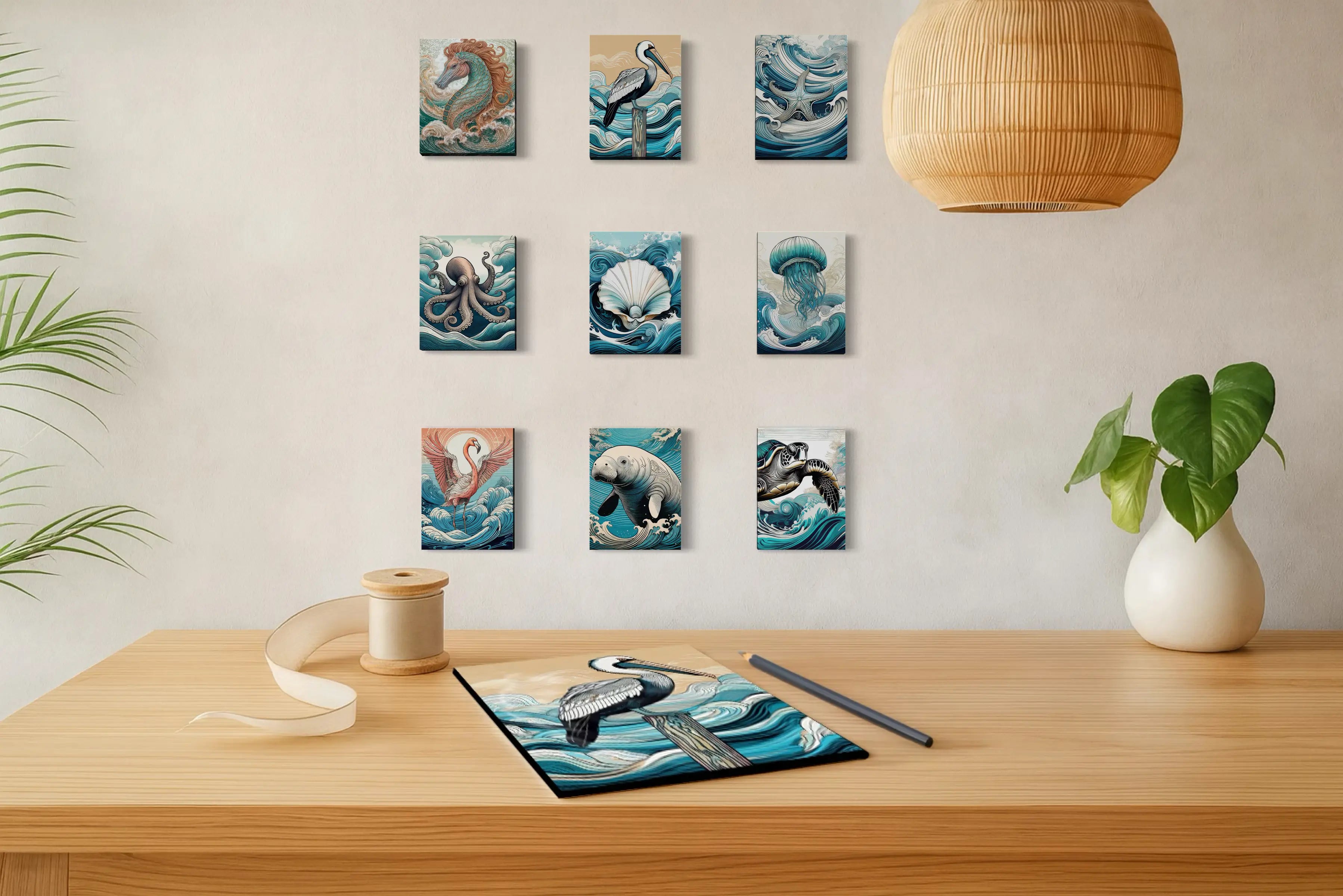
Artwork is one of the easiest ways to bring a sea turtle palette into a room without having to build the entire space around it. A print carrying seafoam, teal, marine blue, or sandy neutrals can introduce the palette naturally while giving the eye somewhere to settle.
On glass, those ocean colors respond especially beautifully to light. Reflections shift across the surface during the day, giving deeper blues more dimension and softer seafoam tones a luminous quality that feels at home with the water that inspired them.
Sea turtle palettes typically include seafoam greens, ocean blues, sandy neutrals, and shell whites inspired by coastal marine habitats.
Yes. These colors create calm, natural spaces that reflect the tones of ocean water and shoreline landscapes.
Sea turtle palettes work beautifully in bathrooms, bedrooms, and living spaces where soft coastal colors support a calm atmosphere.
Sea glass palettes focus on pale aquas and frosted neutrals, while sea turtle palettes include more greens and deeper marine tones.
Author Note
Lisa Reid is the founder and artist behind Echoes of the Sea LLC, a coastal studio dedicated to capturing the light, rhythm, and natural beauty of ocean landscapes.
Her work blends photography, coastal symbolism, and interior design to create glass wall art that reflects the atmosphere of the shoreline. Through Echoes of the Sea, Lisa explores how color, texture, and natural inspiration can transform everyday spaces into calm coastal sanctuaries.


