
The Color Psychology of Coastal Calm | The Coastal Aesthetic Explained
|
|
Time to read 9 min
Cart
Your cart is empty
|
|
Time to read 9 min
Table of contents
The coastal aesthetic blends light, texture, and emotion into design.
Blues calm the mind, greens renew, whites expand, and tans ground.
Subtle pinks, corals, and grays bring warmth, depth, and balance.
Together, they form the color psychology of coastal calm — serenity translated through hue, inspired by the sea’s rhythm.
The coastal aesthetic isn’t just a design trend — it’s an emotional language. These coastal color palettes — inspired by ocean blues, sea-glass greens, warm sand, and coral tones — form the foundation of calming coastal interior design. Each hue, from the faintest sea mist to the warm glow of sand, speaks to the way we experience calm. The color psychology of coastal calm reveals how ocean-inspired tones — the blues, greens, whites, and neutrals of the shoreline — influence our inner landscape as much as our surroundings.
In an age of overstimulation, these colors feel like an exhale. They mirror the rhythms of tide and light — the subtle balance of movement and stillness. This is design not just for the eyes, but for the nervous system.
The color psychology of coastal calm describes how ocean-inspired hues — such as blues, sea-glass greens, sandy neutrals, soft whites, and muted corals — influence mood and emotional balance in interior design. These colors mirror the natural rhythms of the shoreline, helping create spaces that feel serene, restorative, and visually harmonious.
For a deeper exploration of ocean-inspired palettes and how they influence interior design, explore our guide to Coastal Color Psychology and Ocean-Inspired Palettes for Calm Homes.
Learn how it connects to Pantone’s 2026 Color of the Year: Cloud Dancer | The Serenity of the Sea — a tone that embodies clarity, calm, and oceanic grace.
The color psychology of coastal calm refers to how ocean-inspired hues — blues, greens, sandy neutrals, soft whites, and muted corals — influence mood and nervous system regulation. These colors are associated with serenity, clarity, restoration, and emotional balance, making them foundational to modern coastal interior design.
At its heart, the coastal aesthetic is about harmony — light, texture, and tone coming together to create emotional balance. It draws from sunlight on water, salt-washed driftwood, and the quiet poetry of natural materials.
Modern interpretations have evolved beyond the traditional “nautical.” The modern coastal aesthetic and its softer cousin, the boho coastal aesthetic, lean toward grounded serenity: organic forms, powdered pastels, and airy space that invites peace and presence.
Explore this movement further in The Rise of Coastal Modernism: 2026’s Defining Design Movement and Coastal Design Trends for 2026: Warm Neutrals, Organic Textures & Calm Sophistication.
“At the water’s edge, the soul remembers how to breathe.”
Color affects how we think and feel — a truth supported by research in the Journal of Environmental Psychology and Verywell Mind. The hues of the coast calm our bodies and steady our thoughts because they echo nature’s most restorative elements: sky, sea, sand, and sun.
Below, we explore how each tone contributes to the feeling of coastal calm.
Blue is universally recognized as the color of serenity. Studies show it lowers heart rate and promotes clarity of thought. Ocean blues remind us of expansiveness and safety — of breath and horizon.
Blue invites stillness — it’s the color of trust, of thought settling like sand beneath clear water.
Green bridges emotion and nature. It restores focus and evokes quiet optimism. In the coastal palette, sea-glass greens and sage tones mirror seagrass and tidal renewal.
Green steadies us — a whisper of renewal in motion.
Beige, driftwood, and sun-warmed tans create a sensory memory of belonging — grounding energy through warmth and texture. These calming interior colors cultivate safety and ease, like the quiet weight of sand beneath bare feet.
Whites in coastal design aren’t sterile; they’re atmospheric — diffused by light like morning fog. They represent clarity, purity, and openness. Soft whites act as a pause between colors, allowing the mind to rest.
Subtle blushes and corals balance the cool spectrum. According to color psychology, these hues activate gentle joy and emotional comfort — echoing the warmth of connection, sunrise optimism, and the beauty of vulnerability.
A hint of coral or sunlit gold breathes life into stillness — a reminder that calm can also glow.
Gray, often overlooked, is the quiet hero of modern coastal design. It represents equilibrium — the transition between light and shadow. Coastal grays mimic fog, stone, and weathered driftwood. Psychologically, they signify composure and reflection, giving the palette structure and depth.
Gray is the pause between waves — the balance between movement and rest.
The psychology of coastal calm doesn’t exist in single colors alone — it appears through harmonious palettes that mirror the shoreline itself.
You can explore additional ocean-inspired palettes in our Coastal Color Palette Guide, where we explore the full range of shoreline-inspired color schemes.
Ocean horizons blend blues, greens, sand, and mist into subtle gradients that the mind instinctively recognizes as peaceful. Designers often recreate this effect by combining colors that echo natural coastal landscapes.
Below are several palettes inspired by the sea’s most calming environments:
The seashell palette represents the quiet elegance of shoreline neutrals. Pearly whites, sandy beige, warm taupe, and weathered gray echo the natural textures of shells resting in sunlit sand.
These tones create a foundation of calm and openness, making them ideal for bedrooms, spa-like bathrooms, or minimalist coastal interiors where serenity is the primary goal.
This palette reflects the grounding side of coastal color psychology — comfort, balance, and gentle warmth.
Inspired by the gentle rhythm of sea turtles gliding through coastal waters, this palette blends seafoam greens, ocean blues, sandy neutrals, and shell whites into a balanced expression of coastal calm.
The colors reflect both the water and earth elements of the shoreline, combining fluid movement with grounding stability. This harmony makes the sea turtle palette especially suited to restful interiors such as bedrooms, meditation spaces, and quiet living rooms.
Like the sea turtle itself — a symbol of patience, longevity, and steady movement — these colors encourage a feeling of peace and natural balance within the home.
The sea glass palette reflects the soft colors created when ocean waves transform broken glass into smooth treasures along the shore. Frosted aquas, seafoam greens, pale turquoise, driftwood gray, and weathered whites blend into a palette that feels both fresh and restorative.
These tones mirror the translucent beauty of sea glass and are often used in coastal interiors to create a sense of openness, clarity, and calm. Bathrooms, bedrooms, and light-filled living spaces benefit especially from sea glass hues, where natural light can amplify their gentle glow.
This palette embodies one of the purest expressions of coastal calm — color softened by the sea.
The Great Blue Heron palette captures the refined beauty of coastal wetlands. Slate blues, sea mist tones, drift sand neutrals, deep navy, and touches of antique gold reflect the quiet majesty of shoreline wildlife.
These colors add depth and sophistication to coastal interiors while maintaining the calming influence of ocean blues.
This palette is ideal for offices, reading rooms, or spaces where clarity, focus, and quiet confidence are desired.
Flamingo-inspired palettes bring warmth and expressive energy into the coastal spectrum. Flamingo pink, coral blush, quiet teal, and soft sand create a vibrant yet balanced combination reminiscent of tropical lagoons and sunset skies.
While coastal design is often associated with cool tones, touches of coral and blush introduce emotional warmth and connection — making this palette perfect for social spaces like living rooms, dining areas, or creative studios.
This palette represents the joyful side of coastal color psychology — where calm and vitality coexist.
Inspired by the spiral geometry of the nautilus shell, this palette blends coral sea tones, pearly whites, warm shell neutrals, and soft weathered grays.
The colors mirror both the interior and exterior layers of the shell — symbolizing balance, growth, and natural harmony. These warm coastal tones work beautifully in bedrooms, artistic spaces, or serene coastal retreats.
Like the nautilus itself, this palette reflects the timeless rhythm of nature.
To live within the psychology of coastal calm, design becomes an act of mindfulness. Choose soft contrasts — seafoam and sand, linen and oak, rattan and glass.
Let light move freely, and allow space to breathe.
Layer textures like driftwood, cotton, and woven grasses. Art becomes the emotional centerpiece — a reminder of rhythm and renewal.
Reflective materials, like glass wall art, amplify these calming hues by interacting with natural light throughout the day. Discover why glass enhances coastal color depth
Explore more ideas in Make 2026 Your Year of Calm and Serenity with Calm Coastal Home Décor.
Ocean Conservancy — for insights on how preserving calm oceans preserves our collective wellbeing.
Beyond design, color is language — an emotional tether to the world around us. Each shade tells a story of renewal, rhythm, and respect for the sea. The calm you invite into your home reflects the calm you wish for the planet.
Your art and interiors can become quiet activism — honoring the ocean’s beauty while nurturing balance within.
Learn more through Boho Coastal Color Trends for 2026: Earthy Warmth Meets Ocean Calm and Sea Turtle Art & Conservation: Where Beauty Meets Purpose
“The calm you bring into your home reflects the calm you wish for the world.”
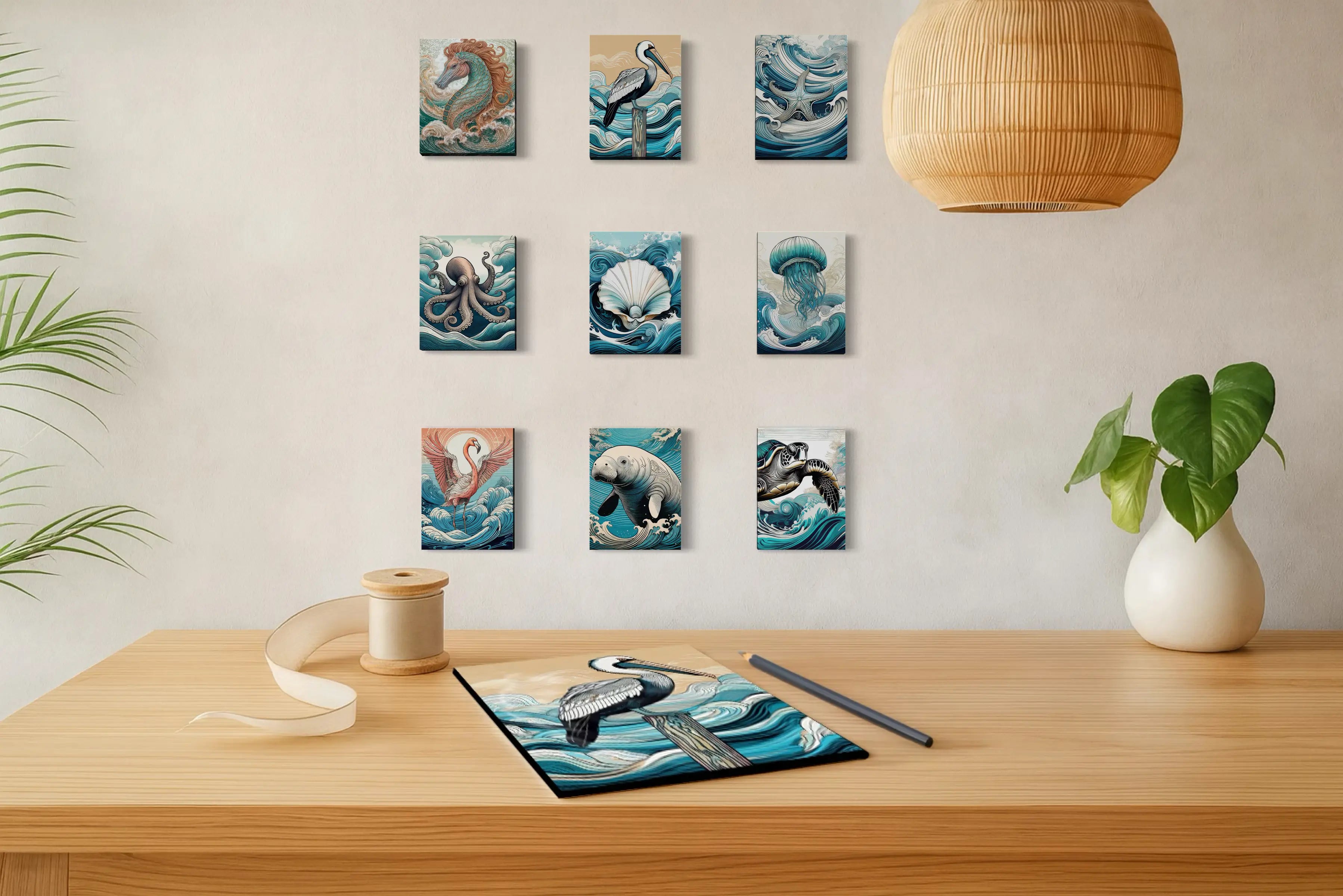
Bring the story of calm to life with art that embodies the color psychology of coastal calm.
Explore ocean-inspired pieces that echo the hues of balance — from seafoam blues to driftwood neutrals and powdered peach skies. Each selection reflects light in a way that enhances depth, clarity, and presence within a modern coastal space. These ocean-inspired artworks reflect the same calming coastal color palettes explored above — from sea-glass blues to warm coral skies.
Discover how the psychology of color can transform your space — one serene hue at a time. From ocean blues that ease the mind to sandy neutrals that ground the spirit, every piece in our Coastal Calm Collection is designed to help you breathe a little deeper and live a little lighter.
A balance of light, nature, and simplicity. It reflects calm through materials and colors inspired by sea and sky.
Blues, greens, whites, and natural neutrals — supported by warm sands, coral accents, and soft grays.
Gray adds depth, maturity, and equilibrium — the emotional still point between contrast and calm.
Start with feeling: choose hues that reflect the mood you want to evoke — clarity (blue), renewal (green), grounding (beige), or connection (coral).
Studies in the National Library of Medicine show blue tones reduce physiological stress and slow heart rate, linking mind and body to peace.
A coastal color palette typically combines ocean blues, sea-glass greens, sandy neutrals, soft whites, and coral accents inspired by shoreline landscapes. These palettes create relaxing interiors that reflect the calming atmosphere of the sea.
✍️ Author Note
Written by Lisa Reid — Founder, Photographer, and Coastal Artist at Echoes of the Sea LLC — creators of ocean-inspired glass prints and art designed to bring calm, connection, and coastal serenity into modern spaces.


