

Sea Glass Color Palette — Soft Ocean Tones for Calm Coastal Interiors
|
|
Time to read 6 min
Cart
Your cart is empty
|
|
Time to read 6 min
Sea glass color palettes combine soft aqua, seafoam green, misty blue, and weathered neutrals inspired by weathered glass found along the shoreline. These ocean-inspired tones create calm interiors that feel light, natural, and quietly connected to coastal landscapes.
Unlike brighter tropical palettes, sea glass colors carry a quiet softness. Their muted character reflects the way ocean water filters light — diffused, layered, and endlessly serene.
In coastal design, this palette creates spaces that feel open, restorative, and deeply connected to the shoreline.
Sea glass begins as ordinary glass shaped by the ocean’s rhythm. Over years of tumbling against sand and stone, its edges soften and its color fades into a frosted, translucent tone.
This natural transformation is what makes the sea glass palette so compelling in interior design.
The colors feel weathered rather than manufactured.
Soft seafoam greens echo shallow coastal waters.
Pale aquas reflect sunlit waves.
Muted grays recall smooth shoreline stones.
Together they create a palette that feels organic and quietly sophisticated.
Where brighter coastal colors energize a room, sea glass tones calm it.
Pair these sea glass tones with curated wall art arrangements in our Gallery Wall Ideas.
The sea glass palette reflects the soft tones created when glass is weathered by salt, sand, and time. These colors feel translucent and airy — echoing the way light filters through shallow coastal water.
The palette includes five foundational tones inspired by ocean glass and shoreline textures.
Seafoam
A pale green touched with ocean blue. Seafoam captures the luminous color of shallow water washing across sand.
Sea Glass
A softened aqua tone reminiscent of weathered glass found along the shoreline. This color brings clarity and lightness to coastal interiors.
Aqua Mist
A delicate blue-green that reflects the hazy atmosphere of sea and sky meeting at the horizon.
Driftwood
A warm weathered neutral inspired by sun-bleached wood shaped by years of tide and wind.
Frosted White
A clean, airy neutral that mirrors the translucent surface of sea glass and allows the softer tones of the palette to breathe.
Sea glass tones rarely exist alone in nature. Along the shoreline they appear beside shells, driftwood, and deeper ocean water — subtle companions that shape the full coastal palette.
Bringing these natural pairings into interior design allows sea glass colors to feel balanced rather than overly cool or delicate.
One of the most natural companions to sea glass tones is soft pearly white.
This luminous neutral reflects light in a way that enhances seafoam greens and pale aquas, creating an atmosphere that feels open and tranquil. Linen textiles, matte ceramics, and whitewashed finishes reinforce the calm clarity of the palette.
Together, these colors echo the quiet brightness of shells and sea glass resting along the shore.
Driftwood grays introduce structure and maturity to a sea glass palette.
Where seafoam tones bring softness and lightness, weathered gray wood textures add gentle contrast and grounding. This pairing works beautifully in living rooms and bedrooms where natural materials anchor the lighter coastal hues.
For spaces that benefit from stronger visual depth, deeper marine blues create a natural complement.
These tones mirror the way shallow coastal water transitions into deeper ocean color. Used in artwork, pillows, or ceramics, deeper blues introduce focus while preserving the calm atmosphere.
Occasionally a sea glass palette benefits from a small hint of warmth.
Muted coral or shell-pink accents introduce gentle energy while still preserving the softness of the palette. Used sparingly in florals, textiles, or decorative objects, coral tones bring warmth and balance to cool seafoam hues.
Living rooms are where the sea glass palette shines. Sea glass tones work beautifully in gathering spaces where natural textures and ocean-inspired artwork create a calm focal point. Explore more ideas in our coastal living room design guide.
Because the colors are soft and neutral, they allow natural textures — driftwood tables, woven fibers, and linen upholstery — to take on greater visual presence.
A sea glass living room often includes:
The palette works particularly well with glass artwork because reflective surfaces echo the translucent quality of sea glass itself.
When placed above a sofa or fireplace, ocean imagery becomes a calm visual anchor that ties the palette together.
Bedrooms benefit from palettes that encourage rest and emotional balance. Sea glass colors naturally support this atmosphere. For additional inspiration, visit our coastal bedroom design guide.
Soft aquas and misty greens create a feeling of quiet openness, while sandy neutrals keep the room warm and grounded.
In coastal bedrooms, these colors often appear through:
Ocean-inspired wall art above the bed completes the composition, introducing movement and depth without overwhelming the room.
The result is a bedroom that feels calm, light, and restorative.
Bathrooms are one of the most natural places to introduce the sea glass palette, where water-inspired tones create a spa-like atmosphere. Discover more ideas in our coastal bathroom design guide.
The soft blue-green tones reflect the atmosphere of shallow coastal water and create a spa-like environment.
A sea glass bathroom might include:
These elements work together to create a space that feels clean, tranquil, and quietly connected to the sea.
There is a reason the sea glass palette feels so emotionally restorative.
Ocean-inspired colors tend to reduce visual stress because they exist within a narrow range of soft, natural hues. Rather than competing for attention, they blend together in gentle gradients.
This effect mirrors what we experience at the shoreline:
soft sky
moving water
sunlit sand
The eye relaxes because the colors flow naturally into one another.
Sea glass tones are one of several ocean-inspired palettes used in coastal design. You can explore additional shoreline color combinations in our Coastal Color Palette Guide.
You can explore the broader psychology behind these tones in The Color Psychology of Coastal Calm, where we look deeper at how ocean-inspired palettes influence mood and atmosphere.
Designing with sea glass colors is less about matching exact shades and more about creating harmony between light, texture, and tone.
Start with a neutral foundation — soft whites, sand, or driftwood.
Layer in pale aquas and seafoam greens through textiles, ceramics, or accent furniture.
Finally, introduce ocean-inspired artwork that reflects the palette and becomes the visual focal point of the room.
This layered approach allows the palette to feel natural rather than staged.
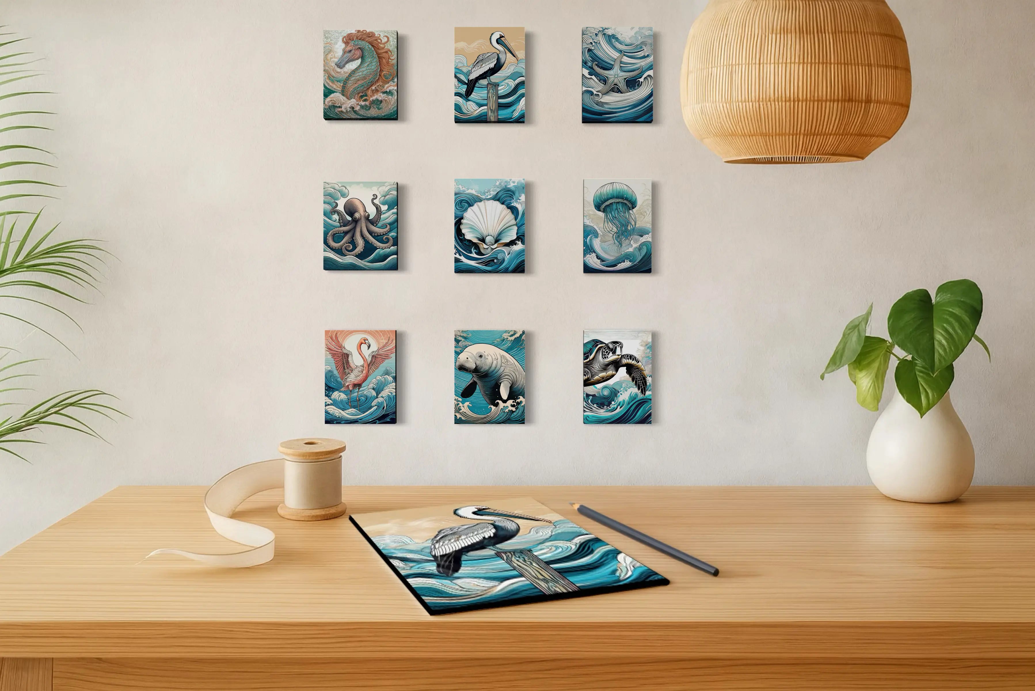
Ocean-inspired artwork is one of the simplest ways to introduce sea glass tones into a space. Glass wall art reflects light in subtle ways that echo the translucent quality of shoreline glass — shifting gently throughout the day as natural light changes.
Explore a curated selection of ocean-inspired prints that capture the calm colors of seafoam water, weathered shells, and quiet coastal horizons.
Discover coastal artwork inspired by sea glass tones and bring the calm rhythm of the shoreline into your home.
What defines a sea glass color palette in coastal design?
Sea glass palettes typically include soft aqua, seafoam green, misty blue, weathered gray, and soft white neutrals.
Why are sea glass colors popular in coastal design?
These tones feel natural and calming because they reflect the soft colors of ocean water and shoreline environments.
Can sea glass colors work outside beach homes?
Yes. The palette’s neutral softness makes it well suited for modern interiors, spa-like bathrooms, and calm contemporary living spaces.
What colors pair well with sea glass tones?
Driftwood beige, warm white, light gray, and natural wood textures pair beautifully with sea glass colors.
Lisa Reid, Founder & Creative Director, Echoes of the Sea LLC
Lisa Reid is the photographer and artist behind Echoes of the Sea — a coastal art studio dedicated to capturing the quiet rhythm of ocean landscapes and marine life.
Her work blends photography, coastal symbolism, and nature-inspired design to create glass wall art that reflects the movement, light, and emotional atmosphere of the shoreline. Through Echoes of the Sea, Lisa explores how ocean imagery and natural color palettes can transform living spaces into calm, restorative environments.
Each piece is inspired by real coastal environments and designed to bring the presence of the sea into modern interiors.


