

How to Choose a Coastal Hygge Color Palette?
|
|
Time to read 7 min
Cart
Your cart is empty
|
|
Time to read 7 min
How to choose a Coastal Hygge color palette begins with soft, natural tones inspired by the shoreline — whites, sandy neutrals, gentle grays, muted blues, and sea-glass greens. These colors create a home that feels calm, warm, and emotionally restorative rather than themed or overly decorative. In coastal hygge design, the goal is to balance light, texture, and comfort so the space feels both serene and lived in.
Imagine stepping into your home after a long day and feeling peace wash over you like the tide — your breath slows, the light softens, and everything around you feels calm and connected. That’s the essence of Coastal Hygge — the harmony between the serenity of the sea and the warmth of Scandinavian comfort.
This isn’t just about decorating; it’s about creating a feeling. A Coastal Hygge color palette sets the tone for your home’s entire atmosphere — airy yet grounded, peaceful yet full of life. It’s the balance between water and warmth, between nature and nurture.
Many homeowners ask, “What colors go best with coastal décor?” or “How can I make my home feel peaceful and welcoming?” The secret lies not in bright nautical blues or bold beach themes, but in soft, natural tones that mirror what you find on a quiet shoreline — sea foam, driftwood, sand, and sky.
You can explore additional shoreline-inspired palettes in our Coastal Color Palette Guide, where we look at the full range of ocean-inspired color combinations used in coastal interiors.
The foundation of a Coastal Hygge home begins with colors that evoke calm and connection — a soft, layered palette that feels like a misty morning on the shore.
Soft Whites and Creamy Beiges
These colors form the backdrop of your sanctuary. Think of foamy waves, weathered shells, and warm sand under bare feet. Shades like ivory, oyster shell, or light beige make your home feel airy and expansive while keeping things grounded in natural warmth. Use them on your walls, trim, or large furniture to create a peaceful base that allows other textures and colors to shine.
Gentle Grays
Inspired by driftwood and sea fog, grays add subtle sophistication. A whisper-light gray softens a room, while a deeper slate or charcoal works beautifully for accent chairs, pottery, or woven throws. Grays bring balance to the coastal palette — they’re the quiet pause between the ocean’s shimmer and the sandy shore.
Muted Blues and Serene Greens
To capture the essence of the sea, focus on soothing, natural shades like seafoam, dusty blue, or soft sage. These hues bring a sense of reflection and depth — they whisper calm instead of shouting color. A room dressed in these tones feels like breathing in salty air after a summer storm: peaceful, restorative, alive.
Color Psychology in Coastal Hygge Design
Every tone carries emotion. Blue promotes relaxation and mindfulness, while green connects us to renewal and balance. Whites and neutrals symbolize simplicity and space. Together, they tell a quiet story of calm and clarity — the kind of serenity that stays with you even when life feels chaotic. This connection between tone and feeling is explored more deeply in The Color Psychology of Coastal Calm.
Once your foundation feels steady, you can weave in subtle warmth and personality through organic accent colors.
Soft Coral and Terracotta
These tones mimic the soft blush of a seaside sunset or the earthy warmth of coral washed ashore. A few well-placed touches — a terracotta vase, coral-hued pillow, or woven wall hanging — add vibrancy and contrast while keeping the mood relaxed.
The “Rule of Three”
Design balance is simple: choose one primary color (your base), one secondary (your anchor), and one or two accent tones (your personal touch). For example, soft white walls, gray furniture, and hints of sage and coral in accessories. This “rule of three” ensures that your coastal hygge color palette remains cohesive and timeless.
Before choosing your palette, picture the kind of feeling you want your space to hold. If your dream is a sunrise-filled room that radiates stillness and hope, our Sunrise Outer Banks Coastal Glass Print is the perfect inspiration piece.
This luminous artwork by Echoes of the Sea captures that magical moment when morning light spills across the water — soft coral, muted blue, and gentle beige all blending like watercolor on glass. Its reflective surface interacts beautifully with natural light, creating a tranquil glow that changes throughout the day.
By starting with art that already embodies your ideal palette, you can design around it — building a home that feels cohesive, meaningful, and alive.
What if your living room could feel like a quiet morning at the beach? With our Sunrise Outer Banks Coastal Glass Print, you can create that very feeling of peaceful coastal hygge.
A true hygge home doesn’t rely on color alone — it thrives on texture. The way light moves through linen curtains, the feel of wood beneath your hand, the glow of a candle on glass — these tactile layers make your palette feel real and lived-in.
Linen and Cotton
Linen is the soul of coastal hygge. Its natural wrinkles and airy drape add depth and authenticity. Use off-white or soft gray linen for curtains to diffuse sunlight into a golden haze. Pair with cotton throws or pillow covers in sea-glass blues or creamy neutrals for a cozy, breathable contrast.
Natural Wood and Rattan
Bring warmth and grounding through wood and woven fibers. Light oak floors, driftwood frames, or rattan pendant lights introduce subtle color variation and texture that complements your softer palette. These materials remind us of nature’s rhythm — imperfect, timeless, and full of character.
The Magic of Glass
Glass transforms a coastal color palette in ways other materials cannot. It captures and amplifies natural light — reflecting, refracting, and glowing much like the sea itself. You can explore more about how reflective surfaces influence light and atmosphere in our Why Glass Wall Art Creates Luminous Coastal Interiors guide.
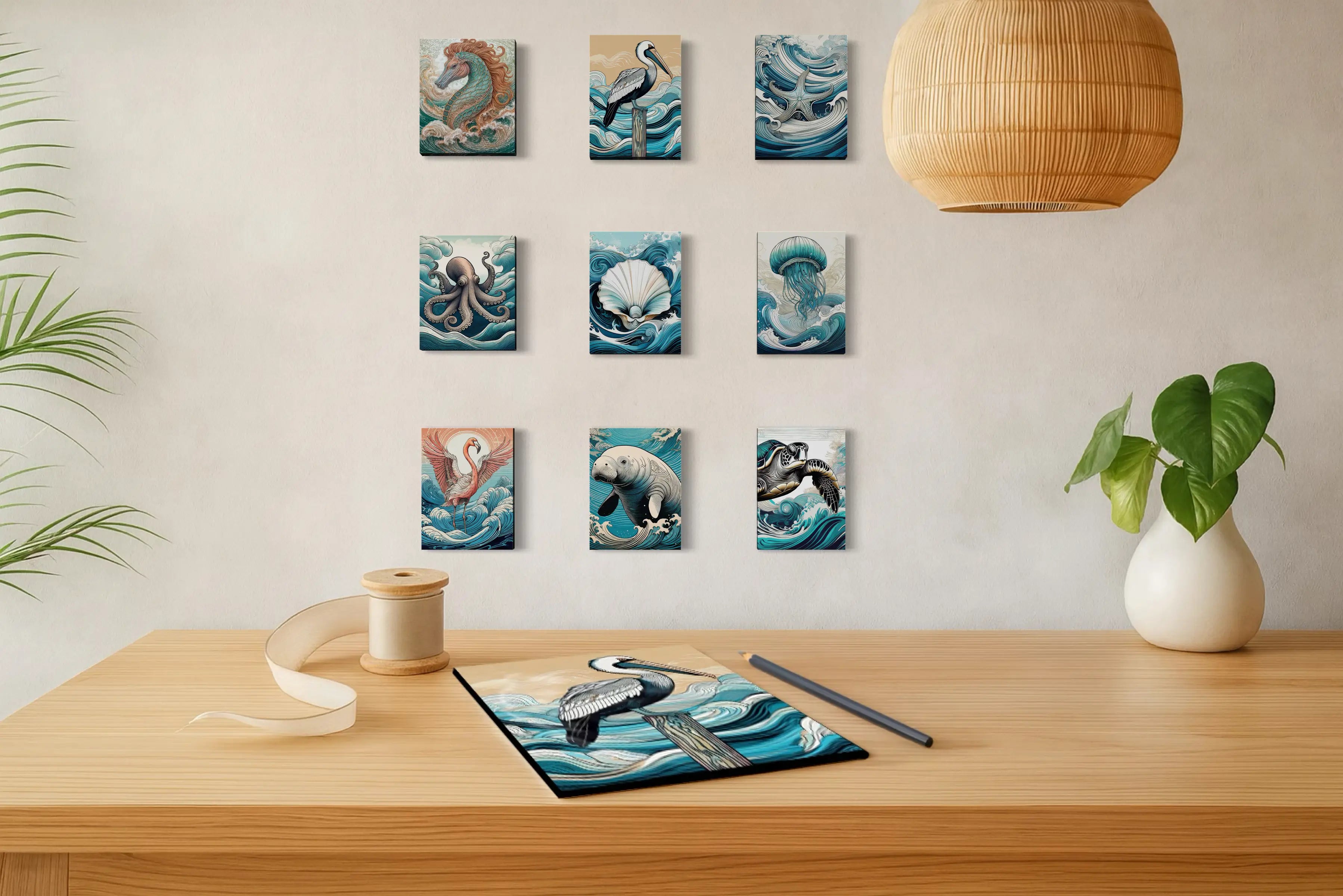
Our Coastal Glass Prints by Echoes of the Sea are designed with this interaction in mind. As daylight shifts throughout the room, the artwork subtly changes with it — warm coral tones glowing in morning light, cooler blues and silvers emerging toward evening.
Unlike traditional canvas, glass art interacts dynamically with its surroundings. The result is a quiet luminosity that keeps a room feeling open, balanced, and alive — echoing the same movement and light found along the shoreline.
If you’ve ever wondered, “How do I choose art that matches my coastal décor?” or “How do I pull all my colors together?” — start here:
Start with the Walls: Choose your base tones first. Soft white, sandy beige, or misty gray creates the foundation for all the layers to come.
Anchor with Neutrals: Use gentle gray or taupe furniture to provide structure. These act like the frame for your softer hues.
Layer Coastal Colors: Introduce muted blues, greens, and corals in textiles — throws, pillows, and rugs.
Add Texture: Combine jute, linen, rattan, and light wood to make your space feel touchable and warm.
Finish with Light & Art: Reflect your chosen palette through glass wall art or decorative mirrors that amplify light and color naturally.
When done well, each element feels connected — the colors, the materials, and the light — blending into a single, calming story that embodies coastal serenity.
Build your palette on soft whites, gentle grays, and muted blues.
Add texture with linen, jute, and natural wood for warmth.
Introduce subtle coral or terracotta accents for balance.
Use glass and reflective surfaces to bring your palette to life.
Anchor your space with Echoes of the Sea wall art for light, color, and calm.
What colors define a Coastal Hygge home?
Think soft whites, misty grays, muted blues, and sage greens — all balanced with natural materials and gentle accents.
How can I make my coastal home feel cozy, not cold?
Texture is everything. Layer natural fabrics like linen and jute, and use warm light to soften cool tones.
What kind of art fits with a Coastal Hygge color palette?
Reflective pieces such as Coastal Glass Prints work beautifully — they echo light, complement natural hues, and create depth.
Can I use bold blues or patterns in a hygge home?
Absolutely — but sparingly. Use them as subtle accents or within wall art to keep your atmosphere serene.
Where can I find art that fits my Coastal Hygge style?
Explore Echoes of the Sea for luminous, ocean-inspired wall art crafted to reflect light, tranquility, and natural beauty.
A color palette isn’t just visual — it’s emotional. It shapes how your home feels, how you unwind, and how you connect to your space. With Coastal Hygge, you’re not just decorating; you’re creating a sanctuary that breathes with you.
Let every shade remind you of salt air, soft light, and quiet mornings by the sea.
Explore the Echoes of the Sea Collection — and bring home art that transforms your palette into peace, your walls into calm, and your home into the sanctuary you’ve always dreamed of.
About the Author — Lisa Reid
Lisa Reid is the founder and artist behind Echoes of the Sea LLC, where coastal art and intentional design come together to create calm, meaningful interiors. Blending her lifelong love of the ocean with a passion for meaningful décor, Lisa creates glass wall art that celebrates the calm, beauty, and resilience of coastal life. Each collection is inspired by the rhythms of the sea and designed to bring serenity, reflection, and connection into your home.
Explore more of Lisa’s work and inspiration in The Coastal Journal, where she shares insights on coastal décor styles, ocean-inspired living, and the healing power of art for the soul.
“Every wave tells a story — my art simply helps it find its way home.”


