
Pantone 2026 Color of the Year Cloud Dancer | The Serenity of the Sea
|
|
Time to read 8 min

Cart
Your cart is empty
|
|
Time to read 8 min
Pantone’s 2026 Color of the Year, Cloud Dancer (11-4201 TCX), is a soft white with a subtle blue undertone inspired by light, air, and reflection. The color reflects a growing design movement toward calm interiors, natural materials, and light-filled spaces.
In coastal design, Cloud Dancer acts as a luminous neutral that allows ocean-inspired colors and textures to breathe. Inspired by the rhythm of the sea, this design approach focuses on simplicity, natural materials, and meaningful art. The result is a home environment that encourages calm, clarity, and emotional balance.
In this feature, The Coastal Journal explores Pantone 2026 Color of the Year Cloud Dancer, a tranquil hue that captures the balance of air, light, and sea.
Pantone 2026 Color of the Year: Cloud Dancer (11-4201 TCX) — a serene, weightless white symbolizing renewal and clarity.
Theme: Calm as power — finding expression through texture, tone, and light.
Seven Companion Palettes: Showcasing Cloud Dancer’s versatility across moods — from pastel tranquility to modern sophistication.
Design Tip: Use Cloud Dancer as a grounding neutral for natural materials — coral, linen, driftwood, and metallic accents.
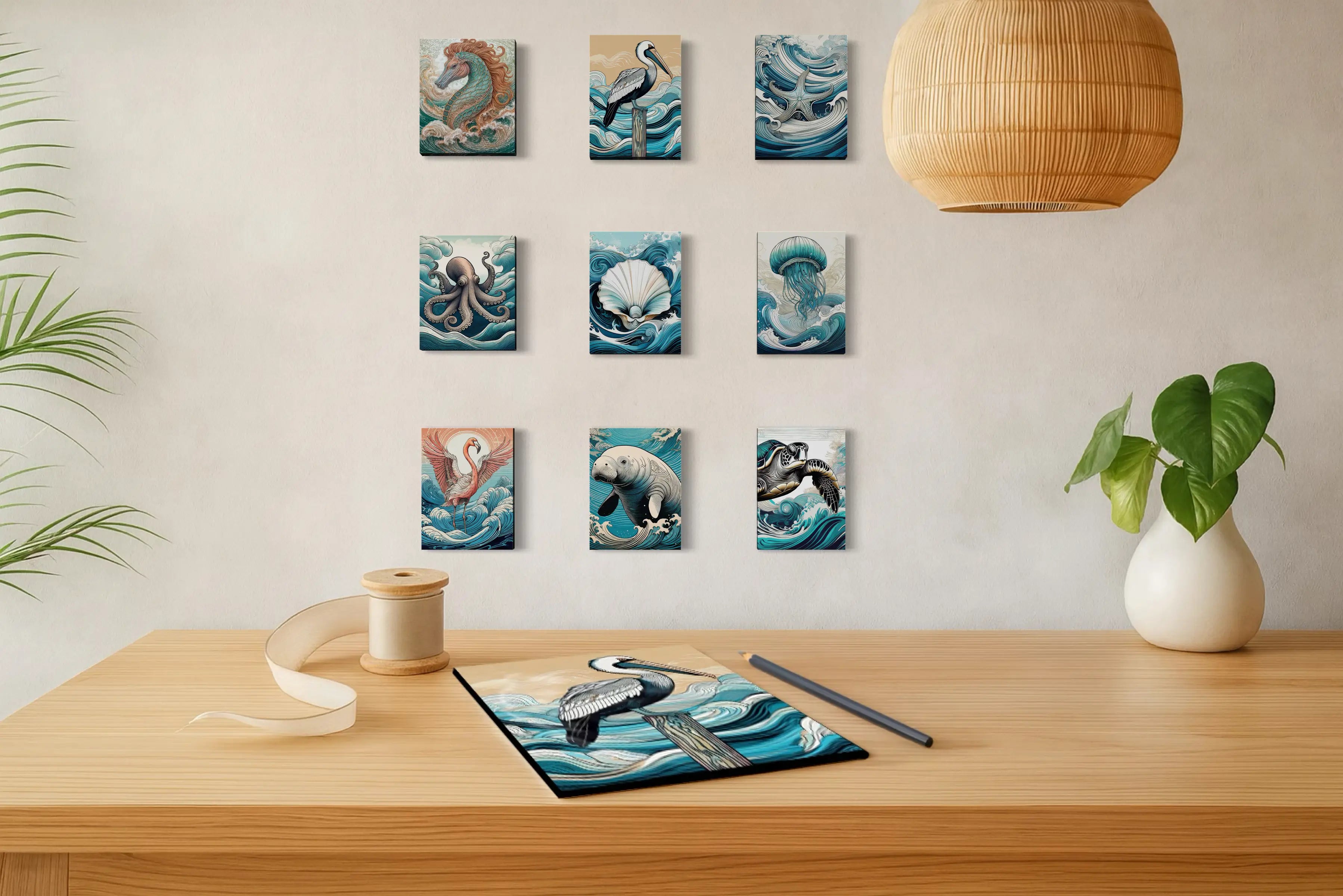
Collection Highlight: Echoes of the Sea 2026 — translating Pantone’s vision into art that captures the serenity of the shoreline.
Shop Now: Explore coastal fine art prints inspired by Pantone’s 2026 palettes.
There’s a hush before the tide rises — a light so diffused it seems to float between air and sea.
That moment of calm is the spirit of Cloud Dancer, Pantone’s 2026 Color of the Year.
Pantone describes it as:
“A soft, weightless white imbued with a whisper of blue — a reflection of clarity, calm, and conscious simplicity.”
At The Coastal Journal, we see Cloud Dancer as more than color — it’s a philosophy. It mirrors what the coast teaches us: peace is power, and stillness reveals beauty.
Pantone’s Cloud Dancer — a collection of airy tones inspired by dawn, mist, and reflection.
It captures the essence of simplicity, balance, and space.
In design, Cloud Dancer serves as both anchor and amplifier — allowing surrounding hues to glow, just as the ocean makes light dance across glass and sand.
When Pantone unveiled Cloud Dancer, critics called it “too safe” or “not bold enough.”
But that quietness is precisely its magic.
Cloud Dancer isn’t absence — it’s invitation.
In coastal design, white is the calm that allows color to sing. It’s the reflection of morning light on still water.
On a Cloud Dancer wall, every shade of sea-glass green, driftwood beige, or coral pink sparkles brighter.
Our Echoes of the Sea glass prints embody this harmony — Cloud Dancer’s serenity lets ocean-inspired hues breathe and glow.
White isn’t empty. It’s where light lives.
In coastal interiors, artwork often becomes the focal point that brings these color palettes to life.
Soft whites with blue undertones expand light and lower visual stress — a principle long supported by environmental color studies. Research in Ergonomics Journal (Küller et al., 2009) found that lighter, cooler hues create feelings of calm and mental clarity by reducing visual stimulation and enhancing perceived space.
Design psychologists such as Leatrice Eiseman, Executive Director of the Pantone Color Institute, describe white as “the color of reflection and renewal” — a tone that allows the mind to pause and reset. It’s no coincidence that coastal spaces, bathed in natural light and pale hues, feel immediately restorative.
In this context, Cloud Dancer embodies the psychology of serenity. Its subtle blue undertone cools and balances, helping interiors feel open and emotionally grounded.
This luminous neutral evokes trust, calm, and mindful presence — aligning perfectly with the ethos of Echoes of the Sea.
In design, Cloud Dancer acts as a canvas of light. It doesn’t compete; it completes. It’s the whisper behind every wave, the pause between colors — the quiet that lets the sea’s tones sing.
You can explore additional ocean-inspired palettes in our Coastal Color Palette Guide, where we explore the full range of shoreline-inspired color schemes.
The connection between color and emotional atmosphere is explored further in The Color Psychology of Coastal Calm.
References: Pantone Color Institute (2025); Küller et al., “The Impact of Light and Color on Psychological Mood,” Ergonomics Journal; Leatrice Eiseman, The Complete Color Harmony: Pantone Edition.
Pantone paired Cloud Dancer with seven companion palettes that explore how light, contrast, and texture shape emotional atmosphere in interior design. Together, they reveal how this soft white moves across moods — from airy minimalism to coastal warmth and deeper tonal contrast.
Pastel and neutral tones make compatible combinations to Cloud Dancer, offering soft shifts in hue that feel natural and airy.
Golden light dances on the shoreline — hues of Mango Mojito, Cocoa Crème, and Pink Lemonade blend like sea foam touched by the rising or setting sun. The Take a Break palette feels alive with warmth and reflection: amber sands, coral skies, and the soft white calm of Cloud Dancer (11-4201 TCX) balancing it all.
It’s the color story of the coast at sunrise and sunset — that fleeting moment when the ocean glows and time slows.
Airy blues and ocean tones create space for light and reflection — the heart of coastal calm. This is the coastal color palette embodied: misted horizons, shifting skies, and the tranquil rhythm of water and air.
Within the Atmospheric palette, Pantone 2026 Color of the Year Cloud Dancer becomes the unifying light — expanding space and reflecting the peace of coastal horizons.
Natural neutrals, driftwood warmth, and muted stone hues define timeless tranquility. The Comfort Zone palette wraps you in the softness of coastal living — the feel of sand-worn wood, sun-faded linen, and smooth seashell tones. Each shade, from Shifting Sand to Ashes of Roses, reflects a kind of grounded serenity that feels both modern and familiar.
Anchored by Pantone 2026 Color of the Year Cloud Dancer, these hues create spaces that invite exhale — a palette of ease, presence, and quiet beauty.
Playful coral, soft greens, and glowing tropical pinks — vibrant yet balanced.
This palette captures the lively warmth of tropical light through Cloud Dancer’s calm clarity. These pieces reflect the palette’s spirited elegance — from flamingo grace to the radiant hues of the coastal tropics. Look for future prints in the Tropic Tonalities palette as Echoes of the Sea continues to explore the vivid harmony between coastal serenity and tropical vibrance.
Playful coral, soft greens, and glowing coastal blues — vibrant yet balanced. These pieces echo Pantone’s “Light & Shadow” palette, from pelican portraits carved in light to dawn skies brushed with Quiet Violet and Golden Mist.
Coastal sophistication — where moonlight shimmer meets golden reflection. The palette evokes evening tides and glassy waters, where deep graphite shadows meet wine-rich warmth and glints of teal and pearl. These tones bring a sense of poised drama to the serenity of Pantone 2026 Color of the Year Cloud Dancer.
Prints in the Glamour & Gleam palette explore contrast and reflection — from nautilus shells and scarlet orchids to the metallic sheen of ocean light. Look for upcoming works in this tonal story as Echoes of the Sea continues to move from day’s glow into the mystery of twilight.
The metallic golds and deep blues of our Hokusai-inspired coastal glass prints — herons, jellyfish, and sea life in motion — echo the same balance of depth and radiance found in Glamour & Gleam
Cloud Dancer invites us to pause — to rediscover beauty in simplicity and serenity in contrast.
Across all seven companion palettes, we see its quiet strength mirrored in every hue: pastel horizons, coral light, deep graphite shadows, and the golden shimmer of twilight seas.
Each palette tells part of the story — together, they form a portrait of balance, emotion, and renewal.
Echoes of the Sea LLC glass prints celebrate this philosophy — capturing Pantone’s 2026 Color of the Year through light, reflection, and the timeless rhythm of the coast.
Bring the calm clarity of Cloud Dancer into your home.
Explore the full Echoes of the Sea 2026 Coastal Collection to experience how Pantone’s color of clarity transforms every space into a sanctuary.
Pantone’s 2026 Color of the Year is Cloud Dancer (11-4201 TCX) — a soft, weightless white symbolizing clarity, simplicity, and serenity.
Pantone sought to reflect renewal through calm — a return to light and space after a decade of vibrancy and saturation.
Some critics feel it’s “too safe,” but Pantone intentionally chose a quiet hue to remind us that subtlety can be powerful. Cloud Dancer’s restraint allows other tones — and emotions — to shine.
Pantone’s seven companion palettes — from Powdered Pastels to Glamour & Gleam — show its adaptability from minimalism to luxury.
Start with a Cloud Dancer wall or background and layer with coastal textures: glass, linen, driftwood, and metallics.Our Echoes of the Sea 2026 Collection showcases how this palette brings serenity to every space.
Written by Lisa Reid, Coastal Artist & Curator of the Echoes of the Sea Collection
Lisa Reid creates ocean-inspired photography and artwork that captures the quiet rhythm of coastal environments. Through Echoes of the Sea, she explores how light, texture, and shoreline color palettes can transform interiors into calm, restorative spaces.


