
2027 Coastal Color & Design Trends: A Richer, More Natural Coastal Palette
|
|
Time to read 13 min
Cart
Your cart is empty
|
|
Time to read 13 min
The coast has never been only blue and white.
Spend enough time near the water and the palette becomes much more complicated—and much more beautiful. There is olive in the marsh grass, charcoal in rain-darkened wood, soft pink inside a shell, lavender suspended in evening light, green-black shadows beneath mangrove roots and dozens of blues shifting across the surface of the water before the day is over.
That is what makes the emerging 2027 coastal color trends so interesting to me.
Across the major 2027 color forecasts, we are seeing botanical greens, earthy browns, softened mineral pinks, atmospheric blue-grays and richer, more expressive blues. At the same time, the broader 2027 coastal design trends point toward warmer woods, deeper material contrast and more immersive ways of using color throughout a room.
What I like most about this direction is that it does not ask us to abandon the calm, natural interiors that have shaped contemporary coastal design. It simply allows those spaces to become more layered, more personal and, in many ways, more faithful to the coast itself.

Several major paint and color authorities have now announced their 2027 selections, and together they tell a surprisingly coherent story.
Sherwin-Williams selected Celery SW 6421, a soft, herbal yellow-green, its 2027 Color of the Year. The shade also appears among the brand's 2027 Continuity Colors, reinforcing the growing preference for nature-inspired greens.. Benjamin Moore chose Webster Green HC-130, a classic, substantial green with enough depth to feel grounded rather than delicate.
Behr introduced Grounded T27-01, a mossy olive green with earthy brown undertones, while Little Greene named Marle 355, a softened warm midtone brown, as its 2027 Colour of the Year.
There is warmth in the forecast as well. Graham & Brown's Rose Earth is an earthy muted pink with clay and brown undertones, while Dulux chose the gentle, silvery green Soulful Sage.
Valspar's Cottage Door 8004-38E brings a softened blue-gray into the year's palette, while WGSN and Coloro's Luminous Blue introduces a much stronger, more saturated expression of blue. Coloro lists the shade as 125-28-38 in its Key Colors collection.
Taken together, these 2027 interior color trends suggest something more meaningful than a new collection of fashionable paint chips. Color is becoming richer and more expressive, yet much of it remains grounded in the natural world. For coastal interiors, that opens the door to a palette that feels less formulaic and much closer to the shoreline itself.
Green has been part of coastal interiors for years, but the 2027 forecasts show how much broader that family of color has become.
Celery feels light, herbal and sunlit. Soulful Sage is gentler and quieter. Webster Green carries more visual weight and has a more traditional character. Grounded moves into that beautiful territory where mossy green begins to meet brown.
These are very different greens, which is exactly why they are useful. Rather than treating green as a decorative accent, the 2027 coastal interior design trends suggest that it can become part of the architecture itself: cabinetry, built-ins, walls, trim or millwork.
That makes intuitive sense in a coastal home. Green appears everywhere along the shoreline once we stop looking only at the water. It is in sea oats, palms, marsh grasses, dune vegetation and the dense plant life that surrounds so many coastal ecosystems.
A pale herbal green can glow beside warm white, shell tones and limestone. A deeper green can give a room structure when paired with natural wood and quieter upholstery. Beside ocean artwork, green often makes blue feel more vivid because the relationship already exists in nature.
The goal is not to reproduce the landscape literally. It is to notice the color relationships that nature has already worked out for us.

One of the most interesting coastal color trends for 2027 is the renewed attention being given to brown.
Behr's Grounded, Little Greene's Marle and several of the deeper shades in Benjamin Moore's 2027 palette all point toward warmer, earthier interiors. For people accustomed to thinking of coastal rooms as pale and airy, brown may sound like an unexpected choice. To me, it never has.
I have loved a deep olive-brown in coastal interiors for years. In fact, a related earthy color has been on my own kitchen cabinetry long before Behr introduced Grounded. It is not the same paint, and it certainly wasn't chosen because I was anticipating a future trend. I chose it because that family of color has always felt connected to the coast I know.
I see it in wet driftwood, tidal earth, mangrove roots, dark grasses and the organic shadows that sit beside all that water and sky.
Little Greene's Marle offers a softer interpretation. Its color is built on yellow ochre, toned down with black and balanced with a small amount of red oxide, creating a warm and nuanced brown rather than a heavy chocolate shade.
Those earthy coastal colors can be especially beautiful beside shell whites, pale stone and water-inspired blues. They can also create a striking background for black-and-white botanical work or pale shells photographed against a dark ground.
Brown is not replacing the familiar coastal neutral palette. It is widening it.

Blue is not disappearing from coastal interiors in 2027. If anything, the range of blues is becoming more interesting.
At one end of the spectrum is Luminous Blue, a much more intense and expressive blue than the pale shades commonly associated with coastal decorating. At the quieter end, Valspar's Cottage Door and Benjamin Moore's Nelson Blue move toward softened, hazier blue-gray territory.
That range feels true to the sea itself.
Water can look almost silver at sunrise, turquoise in the shallows, slate blue beneath cloud cover, intensely cobalt in strong light or nearly black when depth and weather change its character. No single paint swatch can capture that, nor should it.
For 2027, I think the most interesting coastal rooms will allow blue to take on different roles. A quiet blue-gray can create atmosphere across a wall or built-in. A more saturated blue can appear through artwork or one confident architectural detail. Deep blue-green can provide contrast in a room otherwise built around sand, wood and soft natural neutrals.
The important shift is not that blue is going away. It is that blue is becoming less predictable.

Pink is another color appearing in a more sophisticated form in the 2027 forecasts.
Graham & Brown's Rose Earth is an earthy, muted pink with clay and brown undertones inspired by traditional mineral pigments. Benjamin Moore's Wild Aster adds a dusky, softened pink to its 2027 palette as well.
These colors feel very different from traditional pastel pink. They remind me more of the interior of a conch shell, weathered coral, a thin wash of sunset across the horizon or the dusty rose tones that sometimes appear in coastal flowers and stone.
In a coastal room, mineral pink can bring warmth beside blue-gray, soften deeper green and brown, or keep a neutral interior from becoming too cool.
The real opportunity is not to follow a prescribed pairing. It is to recognize that the coast contains warmer colors too.
If you want more specific ideas for combining some of these unexpected hues, you can explore Unexpected Coastal Color Combinations That Just Work.

Color drenching is not a new decorating technique, but its more nuanced forms are becoming increasingly relevant to 2027 interior design trends.
Traditional color drenching uses one color across multiple architectural surfaces. Benjamin Moore demonstrates this in its 2027 imagery with Wild Aster 1240 across walls, trim and ceiling, changing the paint finish rather than the color itself.
Dulux takes the idea in another direction with double drenching. In its 2027 example, Soulful Sage is paired with the deeper green Fern Forest, allowing related colors to move across a room rather than covering every surface in one identical shade.
That layered approach is particularly appealing in coastal interiors.
Imagine a quiet sea-glass green across the walls with deeper marsh green on cabinetry, or a softened blue-gray room with one architectural surface shifting toward a deeper ocean tone. The color remains connected, but the room gains depth.
What makes this work is restraint. The point is not to paint everything simply because the technique allows it. It is to create an enveloping atmosphere by using closely related shades with enough variation to keep the room alive.
That feels remarkably similar to the coast itself, where the water, sky and vegetation often belong to the same visual family without ever becoming a single flat color.

One of the most useful parts of the 2027 research has nothing to do with wall paint.
Sherwin-Williams Industrial Wood's separate 2027 forecast identifies warmer midtone woods, walnut-influenced colors, pale organic stains, chalked finishes and deeper atmospheric wood tones. That matters because coastal design trends in 2027 are not only about color on the walls. They are also about the materials surrounding those colors.
For years, many coastal interiors leaned heavily toward bleached, whitewashed or very pale wood finishes. Those still have their place, but a richer wood tone changes the mood of a room in an entirely different way.
Walnut and warmer midtone woods can make blue and green feel more luminous. Darker wood can give pale stone and linen greater contrast. Even a quiet mineral pink becomes more grounded when it sits beside a deeper natural finish.
Texture matters here too. Linen, natural stone, woven materials, ceramics and wood with visible grain all add variation without adding clutter.
I am especially drawn to the contrast between those tactile, often matte materials and glossy frameless glass artwork. One surface absorbs light while another reflects it, and the relationship between them makes the room feel more dimensional.
For more ideas on creating thoughtful, layered coastal interiors, visit our Coastal Design Ideas page.

One reason I hesitate to think about color only through paint swatches is that color is never truly static. Graham & Brown notes that Rose Earth changes character as the light changes, appearing rosier in some conditions and revealing more terracotta and taupe in others.
Anyone who spends time near the water already understands that idea. The sea can change color repeatedly in a single afternoon. Sand becomes warmer in low light. Green vegetation cools beneath a cloud. A shell that looks almost white in the morning can reveal pink, lavender or gold later in the day.
Our interiors behave the same way.
Before committing to a deeper green, blue-gray or earthy brown, it is worth watching the color through an entire day. Notice what happens beside the floor, the cabinetry, the upholstery and the artwork already in the room.
This is also one reason I love working with glass. A frameless glass print does not behave like a matte painted wall or woven fabric. Its glossy surface responds to the changing light in the room, creating another subtle layer of movement.
That relationship between color and light is one of the qualities that makes coastal interiors feel alive rather than simply coordinated.

A richer coastal palette does not necessarily require repainting the entire room. Art can introduce the strongest blue, the olive green, the shell pink, the lavender or the turquoise while the rest of the space remains quiet.
I do not believe artwork has to match the furniture. In fact, the most memorable piece in a room often introduces a color or sense of movement that does not appear anywhere else. A neutral room can hold a vivid stretch of Gulf water; warm brown cabinetry can become a beautiful setting for white shells or botanical forms; and a space built around stone, linen and natural wood may come alive when one work introduces turquoise, coral, deep blue or sunset lavender.
This is one reason large-scale coastal wall art works so well in a layered interior. It can carry the emotional connection to water, light and landscape without asking every other object in the room to do the same job.
Rather than treating art as the final accessory, consider allowing it to become one of the first clues to the room's palette.
Color does not always have to begin with paint. Sometimes a single piece of art can introduce the olive green, stormy blue, shell pink, warm brown or soft lavender that changes the feeling of an entire room.
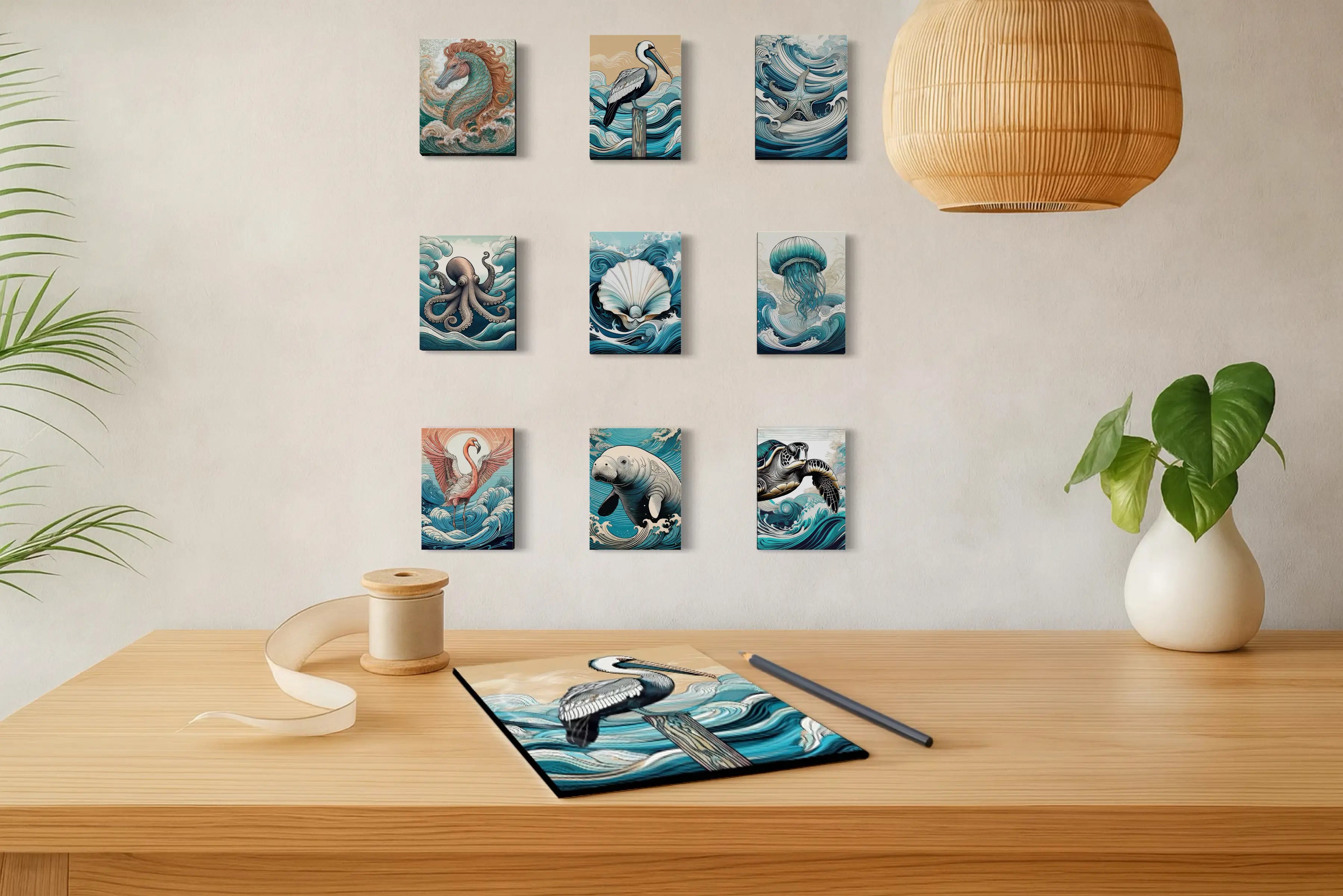
The works below carry several of the colors and moods woven through this article. If you are especially drawn to the year’s botanical greens, take a look through our botanical collection, where shells, flowers, succulents and coastal forms bring those natural tones into the home in a quieter, more organic way.


The most encouraging thing about the 2027 coastal color and design trends is not that one particular green, brown or blue has suddenly become fashionable. It is that the palette of the home is widening.
The warm neutrals and natural materials that have shaped sophisticated coastal interiors in recent years are not disappearing. They are being joined by deeper green, richer brown, atmospheric blue, mineral pink and more immersive ways of using color across a room. To me, that feels much closer to the coast I know, where color is rarely flat, predictable or perfectly coordinated.
Nature gives us contrast, reflection, variation, shadow, weather and colors that change from one hour to the next. The most beautiful coastal interiors can do the same—layering materials, allowing light to move across surfaces and choosing colors that feel connected without needing to match.
The opportunity for 2027 is not to chase every new trend. It is to notice more of what has been there all along, and bring those colors, textures and moments of light into our homes in a way that feels personal.
Looking for more ways to bring the colors of the shoreline into your home? Explore our Coastal Color Palettes guide, featuring 45 nature-inspired palettes drawn from ocean waters, seashells, coastal wildlife, and shoreline landscapes.
The strongest 2027 color directions include botanical greens, olive and earthy browns, atmospheric blue-grays, stronger saturated blues, muted mineral pinks and warm natural neutrals. For coastal homes, these colors expand rather than replace familiar shades of blue, white and sand.
Yes. Blue remains central to coastal design, but the range is becoming broader. Soft blue-gray, deep ocean blue, saturated blue and blue-green all appear relevant to 2027 coastal interiors. The shift is away from relying on one predictable pale blue throughout an entire room.
Yes. Both occur naturally throughout coastal landscapes. Brown appears in driftwood, tidal earth, roots and weathered wood, while olive is common in marsh grass, sea oats and coastal vegetation. These colors can create a grounding contrast to blue, white and pale stone.
Color drenching is the use of one color, or closely related colors, across several architectural surfaces rather than limiting color to a single wall. In 2027, tonal and double-drenching approaches are being used to create more immersive interiors with subtle variations in shade and finish.
It can work beautifully when the colors are drawn from nature and used with restraint. Muted greens, blue-grays and other related coastal tones can create a room that feels atmospheric and cohesive rather than overly decorated.
Sherwin-Williams' 2027 industrial wood forecast highlights warmer midtone woods, walnut-influenced colors, pale organic stains and deeper atmospheric finishes. These richer woods pair naturally with linen, stone, woven textures and glass in coastal interiors.

About the Artist
Lisa Reid is the artist and founder of Echoes of the Sea, a coastal wall-art studio inspired by the changing colors, textures, wildlife and light of the shoreline.
Her work grows from close observation of the coast: water shifting beneath changing skies, marsh grasses moving in the wind, shells revealing unexpected colors and the quiet details that make every shoreline different. Through ocean imagery, botanical studies, shells and other nature-inspired work, she creates frameless glass art intended to bring some of that restorative coastal atmosphere into the places where we live.
For Lisa, coastal design begins with observation rather than a decorating formula. The most beautiful palettes are often already there—in water, sand, vegetation, shells, stone and light—waiting to be noticed.


