
Luminous Blue for 2027: A Deeper Ocean Blue for Coastal Interiors
|
|
Time to read 14 min
Cart
Your cart is empty
|
|
Time to read 14 min
Some colors arrive as trends. Others feel more like recognition.
When WGSN and Coloro named Luminous Blue their 2027 Color of the Year—officially referenced as Coloro 125-28-38, a saturated blue that works especially well with warm wood, ivory, stone and soft gold—I was immediately drawn to it. This was not a color that felt unfamiliar to me. I started looking through my own artwork and realized how often I had already returned to this same family of ocean blues: sometimes cobalt, sometimes marine, sometimes almost electric.
It was there in the deeper passages of waves, in jellyfish, sea turtles and herons, and in the blue-and-gold pieces where I had used strong color simply because I loved what it did to the image.
Then we began placing some of those pieces into rooms inspired by Luminous Blue, and that was when the color became even more interesting. Against deeper blue walls, ivory looked brighter, walnut seemed richer, turquoise became more luminous and gold took on a beautiful warmth. The artwork did not disappear into all that blue; in many cases, it came alive in a completely different way.
That is what I want to explore here—not simply another Color of the Year announcement, but why a blue this vivid feels so natural in modern coastal interiors, how to use it without overwhelming a room, and why it works so beautifully with the colors and materials that already belong to the coast.
In April 2025, trend forecaster WGSN and color specialist Coloro announced Luminous Blue as their Color of the Year for 2027. Its official Coloro reference is 125-28-38. This is the WGSN × Coloro selection rather than an announcement from Pantone.
WGSN’s broader 2027 forecast explores ideas of interconnectedness—past and future, nature and technology, the familiar and the unexpected. Luminous Blue fits easily into that story. It has the depth and visual authority of an old-world pigment, but its intensity can also feel strikingly contemporary.
For interiors, that gives us a blue with far more presence than the hazy sea-glass colors often associated with coastal decorating. It is strong enough to shape the mood of a room, yet it can also make quieter materials—warm wood, ivory linen, natural stone and soft brass—look even more beautiful.
It is worth making one distinction here. Luminous Blue is a specific Coloro shade. The rooms and artwork in this article explore blues that share its spirit, from cobalt and marine blue to turquoise and deeper ocean tones, rather than claiming that every blue shown is an exact color match.

Coastal decorating has spent years favoring the softer side of blue: mist, faded sky, sea glass, weathered blue-gray and pale aqua. I still love those colors, but they represent only one part of what the coast actually gives us.
Spend enough time beside the water and blue becomes far more complicated. The shallows may be translucent turquoise or green. Farther out, the water deepens into cobalt and marine blue. Beneath clouds it can turn slate-colored, and under strong sun there are moments when the Gulf becomes so intensely blue it seems almost illuminated from within.
That is the side of coastal color that Luminous Blue brings forward. It has energy, but that does not mean a room using it has to feel loud. In fact, some of the most successful spaces we explored were remarkably calm because the stronger blue was balanced with natural wood, warm whites, stone and simple upholstery.
The lesson is not that every coastal room suddenly needs darker blue walls. It is that our idea of what qualifies as a coastal blue can become much more expansive.
Looking through my artwork after seeing Luminous Blue was unexpectedly exciting because I began noticing just how often variations of this color had already found their way into the work.
As an art student, I was fascinated by Katsushika Hokusai and the extraordinary movement in his waves. Later, as a graphic artist, I was drawn to Art Nouveau for many of the same reasons: flowing line, rhythm, movement and decorative detail. Those influences eventually found their way into my own interpretations of ocean life.
When I began creating waves, jellyfish, sea turtles and herons, I was not thinking about future color forecasts. I was choosing colors that felt right for the subject and that gave the image the energy I wanted. Deep blue, turquoise and gold became combinations I returned to because they reminded me of water and sunlight.
Seeing a color so close in spirit become part of the 2027 design conversation made me look at those pieces differently. It also made me curious about how these stronger blues could work in the rooms around them.
That is where this article really began.
If you are curious about a saturated blue but are not ready to commit to an entire room, one strong wall can be a beautiful place to begin.
A deeper blue creates an especially striking backdrop for coastal artwork containing ivory, pale aqua, turquoise or gold. The contrast can make lighter passages in the image appear brighter while warmer metallic details become more pronounced.
I would keep the rest of the room fairly restrained. Ivory seating, a walnut or oak table, natural stone and perhaps one or two quiet accessories are enough. The blue already provides the drama, so everything else can give it space.
This approach works especially well if the art itself contains related blues without matching the wall exactly. Slight variations create more depth than trying to reproduce one identical shade throughout the room.
If you love strong color, color drenching takes the idea further by carrying one color—or closely related shades—across walls, trim, doors, millwork and sometimes the ceiling.
A room drenched in deep blue can sound intense, but the effect is often more cohesive than a dark wall broken up repeatedly by bright white trim. When the architecture belongs to one continuous color family, the eye settles differently and furniture begins to stand out more clearly.
For a coastal office, bedroom or library, I would balance that amount of blue with walnut furniture, ivory upholstery, stone, woven fibers and warm metal. Natural light is especially important because it changes the character of saturated color throughout the day.
Before committing, bring samples into the actual room and watch them from morning through evening. Deep blues can shift dramatically depending on the direction of the windows and the warmth of surrounding materials.

Of all the combinations we explored, this may be my favorite.
Luminous Blue with walnut and soft gold is gorgeous.
The blue brings intensity and depth; walnut adds warmth and visible grain; brass or gold catches the light between them. Add ivory linen, pale stone or a natural woven rug and the room feels balanced rather than overly dramatic.
This combination works particularly well with blue and gold coastal wall art because the art can connect the whole room without requiring everything to match. A deep blue passage relates to the wall, gold details echo the metal accents, and lighter aqua or ivory provides contrast.
If the idea of a bright cobalt-inspired room feels too bold, warm wood is one of the easiest ways to make the color feel grounded and livable.

Strong blue does not have to live on the walls.
In a warm white or ivory room, artwork containing saturated ocean blue can become the main source of color. A blue velvet chair, a pair of pillows or one ceramic accent can repeat just enough of that hue to make the room feel connected.
I have loved this family of blue in my own home for years, including blue velvet seating, because it adds richness without requiring the entire room to revolve around it. There is something wonderful about allowing a quieter space to have one place where the color becomes more intense.
I also do not believe every color in a piece of art needs to be repeated throughout the room. Sometimes the artwork should be the place where the strongest color is allowed to live.
That approach is especially useful if your style leans lighter, warmer or more neutral but you still want some of the depth Luminous Blue brings.
Light and Airy
Warm ivory walls let the artwork and blue velvet carry the color.
Immersive and Enveloping
Color-drenched walls create a deeper, more atmospheric coastal room.


Luminous Blue can be introduced quietly through art and accents, or used more immersively across the room. Both approaches work when the stronger blue is balanced with warm materials and natural light.
One of the challenges of decorating with a strong blue is the temptation to make every other blue match it perfectly.
I would resist that.
Water rarely gives us one blue at a time, and a room can benefit from the same variation. An abstract wave piece containing turquoise, cobalt, marine blue, pale aqua and touches of gold can bridge several shades without making the palette feel disjointed.
Against a deeper wall, the darker colors recede while the lighter aqua and white seem to move forward. Against a pale wall, those same saturated passages become the focal point.
This is also a contemporary way to create a coastal feeling without relying on literal beach imagery. The movement and color suggest water even before the subject is identified.
The most successful pairings tend to either warm Luminous Blue or give it breathing room.
Partner color or material |
Why it works |
Where to use it |
|---|---|---|
Warm ivory and shell white |
Keeps strong blue light and open |
Upholstery, bedding, curtains |
Walnut and natural oak |
Adds organic warmth and contrast |
Tables, desks, shelving |
Sand and limestone |
Grounds the palette naturally |
Floors, rugs, ceramics |
Muted olive and celery |
Connects blue back to vegetation |
Textiles, greenery, accents |
Mineral or earthy pink |
Adds an unexpected warmer counterpoint |
Pillows, flowers, small details |
Soft brass and gold |
Brings warmth and reflected light |
Lighting, hardware, artwork |
You certainly do not need all six. In many rooms, saturated blue, walnut and ivory may already be enough.
For a broader look at the colors and natural materials emerging for the coming year, visit our 2027 Coastal Color & Design Trends. If you would rather explore ocean-inspired palettes beyond one forecast shade, our Coastal Color Palettes hub offers a much wider range of possibilities.
There is one danger with any Color of the Year: once we begin seeing it everywhere, it is easy to feel as though the whole room needs to be redesigned around it. I would resist that impulse. If you already have a room you love, start by asking what a stronger blue could add rather than what it should replace. The answer might be one piece of blue coastal wall art, a velvet chair, painted cabinetry or a single saturated wall rather than an entirely blue room.
I would also avoid trying to match Luminous Blue exactly across every surface. The ocean certainly does not. Cobalt, marine blue, turquoise, blue-gray and deeper indigo tones can live beautifully together when the relationship between them feels intentional. In fact, some of the most interesting cobalt blue interior design comes from layering several blues rather than reproducing one shade over and over.
Blue and white will always have a place in coastal interiors, but introducing another natural element can make the combination far more interesting. Walnut, olive, limestone, brass or a small amount of mineral pink can add warmth and complexity without taking away from the blue.
There is no correct order for building a room around color. Sometimes you fall in love with the wall color first; other times the artwork provides the beginning of the palette, and everything else grows from what you notice inside it.
That is one reason this particular Luminous Blue interior design story became so interesting to me. When I began placing artwork I had already created into rooms with deeper blue walls, I could suddenly see relationships that had been there all along. Warm gold details became more luminous, walnut looked richer, pale aqua seemed brighter and the strongest blues in the artwork gained depth instead of disappearing into the wall.
The same idea works in a lighter room. Against warm white or ivory, a piece of saturated blue coastal wall art can carry nearly all of the room's stronger color. Add one related accent—a velvet chair, a pillow or a ceramic vessel—and the room begins to feel connected without becoming overly coordinated.
With glass art there is another layer as well. The glossy surface responds to natural light, so both the artwork and the room shift subtly throughout the day. That changing relationship feels especially appropriate for work inspired by water, because the sea never gives us exactly the same blue twice.

What I keep returning to is how natural this color feels once I stop thinking about it as the 2027 Color of the Year and begin thinking about where I have already seen it.
The coast has always contained versions of this blue—in deeper water, the underside of a wave, the blue-gray of a heron’s feathers, the translucent body of a jellyfish and those extraordinary moments when sunlight makes the ocean look almost electric. Depending on what surrounds it, the color can feel serene, dramatic, elegant or full of energy.
That is also why I think Luminous Blue for 2027 has more staying power in coastal interiors than a trend label might suggest. It works beautifully with materials that already belong naturally in these spaces: walnut and oak, limestone, woven fibers, ivory linen, soft gold and botanical greens. Even blue-and-gold coastal artwork, which can sound quite bold in theory, becomes surprisingly sophisticated when those colors are grounded by warm wood and quieter natural textures.
I loved these blues in my artwork long before they became part of a forecast, and seeing how beautifully the work responds to Luminous Blue-inspired rooms has only made me appreciate them more. The trend did not introduce me to the color; it made me look again at something I had already been drawn to.
If Luminous Blue reminds you of water you love, a place you remember or a piece of art that makes you stop for a moment, that connection matters more than whether the color is fashionable this year. A trend may give us permission to notice a color, but what makes it last in our homes is the meaning we attach to it.
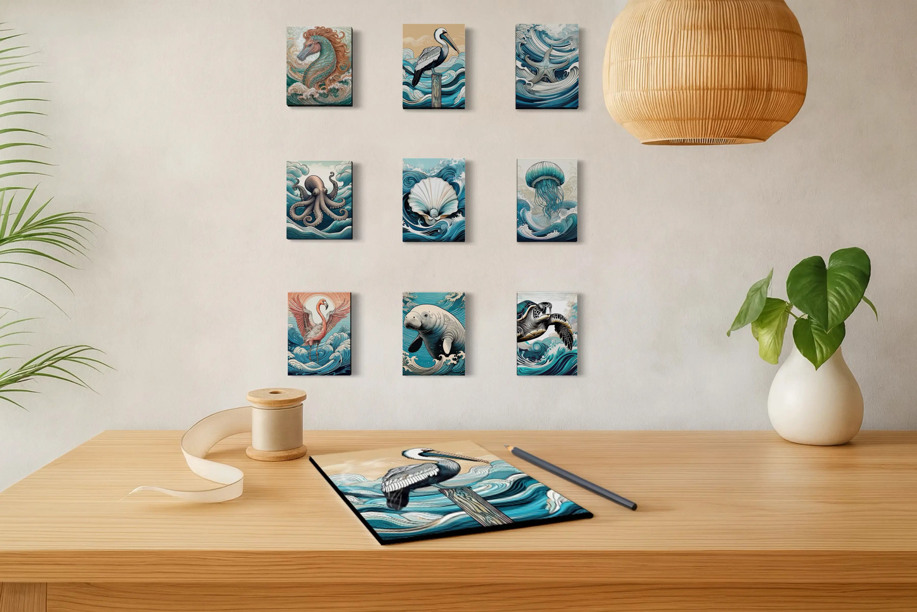
One of the easiest ways to bring a stronger ocean blue into a room is through artwork. It allows the color to have real presence without asking the entire space to revolve around it, and it can introduce several related blues—cobalt, turquoise, marine blue and sea-glass tones—at once.
The pieces below are some of the works that made this Luminous Blue story feel so exciting to me. Each carries a different expression of blue, from flowing water and sea life to gold-lined waves and coastal birds, and each shows how naturally this color family already lives within the world of Echoes of the Sea.


No. Luminous Blue is WGSN × Coloro’s 2027 Color of the Year, with the official Coloro reference 125-28-38. Pantone is a separate color organization with its own annual Color of the Year announcement.
Luminous Blue is a rich, saturated blue with a vivid, almost illuminated quality. It may remind viewers of cobalt or deep marine blue, but those are descriptive comparisons rather than exact matches. For the precise shade, use Coloro reference 125-28-38.
Yes. Luminous Blue works especially well in modern coastal interiors when it is balanced with warmer and quieter materials such as ivory, walnut, oak, limestone, woven fibers and soft brass. It can be used on walls, cabinetry, textiles or artwork depending on how much color you want in the room.
Try introducing the color through blue coastal wall art, a velvet accent chair, pillows, ceramics or smaller accessories. Repeating the blue in only two or three places can create a connected room without making the color feel overwhelming.
Color drenching is a decorating technique in which walls, trim, doors, millwork and sometimes ceilings are painted in the same or closely related colors. With a saturated blue, the effect can create a cohesive, immersive room rather than a series of contrasting architectural surfaces.
Warm ivory, walnut, oak, sand, limestone, muted olive, soft gold and mineral pink can all work beautifully with Luminous Blue. The strongest combinations usually balance the cool intensity of the blue with warmer natural materials.
No. Luminous Blue is a specific Coloro shade, reference 125-28-38. Cobalt blue is a broader color family and pigment reference. They can look related, which is why cobalt-inspired interiors and artwork are useful visual comparisons, but they should not be treated as exact matches.

About the Artist
Lisa Reid is the artist and founder of Echoes of the Sea, a coastal glass-art studio inspired by the changing colors, movement, wildlife and light of the shoreline.
Her work grows from close observation of the coast and from a lifelong love of art, pattern and movement. Influenced by the sweeping rhythm of Hokusai’s waves, the flowing lines of Art Nouveau and the constantly changing colors of Gulf water, Lisa creates ocean imagery, marine life and nature-inspired compositions designed to bring some of the sea’s energy and serenity into the home.
For Lisa, color begins with what is already present in nature: the deep blue beneath a wave, sunlight flashing gold across the water, turquoise shallows, shell whites and the unexpected colors that appear when the coast is observed closely.


