

How to Decorate a Large Wall with Diptych, Triptych & Multi-Panel Art
|
|
Time to read 14 min
Cart
Your cart is empty
|
|
Time to read 14 min
A large blank wall can make even beautiful artwork look surprisingly small. I see this most often above a long sofa, king bed, dining table, console, or in an open living room where there is simply more wall than one standard-size piece can comfortably anchor.
The answer is not necessarily to add more décor. Often, the better solution is artwork with the right proportion and visual rhythm for the space—whether that means one extra-large piece, a diptych, a triptych, or a coordinated group of large prints.
That is one reason I began working more seriously with multi-panel compositions. A photograph that felt contained within one panel could suddenly keep moving: a wave could stretch farther across a wall, coral could branch from one panel into the next, and shells, starfish, or sea urchins could become part of a larger visual landscape rather than a single still life.
But multi-panel art is only one solution. Sometimes one substantial print is exactly enough, and sometimes three separate but related pieces work better than one photograph divided across three panels.
So rather than asking, How do I fill this entire wall?, start with a more useful question:
What does this wall need in order to feel balanced?
For a large wall above a sofa, bed, console, or dining table, start with the furniture beneath it rather than the full width of the wall. As a general guideline, artwork spanning roughly 60–75% of the furniture width often feels balanced.
Choose one large piece for simplicity, a diptych for two-panel balance, a triptych or 3-panel artwork when you need greater width and movement, or a coordinated group of prints when you want the wall to feel more collected. The goal is not to cover the wall; it is to give the space enough visual presence that it feels intentional.
One of the easiest mistakes to make with a large wall is assuming the artwork needs to be almost as large as the wall itself. Usually, it does not.
A 14-foot wall might hold an 84-inch sofa, for example. In that situation, the sofa is often the better starting point because it creates the visual boundary within the larger architecture. Judge the artwork in relation to the furniture rather than all the empty wall surrounding it.
The right answer may be one substantial photograph, two related panels, or a triptych stretching across most of the seating area. What matters is not maximum coverage, but enough scale to make the art feel as though it belongs there.
For more detailed measurements, see What Size Glass Wall Art Over a Sofa? A Coastal Guide
A large wall does not automatically call for a gallery wall or one enormous piece of art. There are several ways to create scale, and each one changes the way the room feels.
Sometimes the simplest answer really is the best one. A single extra-large print can become a strong focal point without dividing the wall visually, especially when the photograph already has a clear central subject—a nautilus, a coral study, a bird, a dramatic wave, or a landscape with enough negative space around it.
One large piece is also useful when the room already contains architectural detail, shelving, patterned textiles, or statement furniture. Instead of adding more visual information, the artwork gives the eye one clear place to land.
Large does not have to mean complicated.
A diptych is an artwork made from two related panels. They may contain one continuous composition or two separate images connected through color, subject, style, or mood.
Diptychs are useful when a single piece feels a little too contained but a three-panel installation would be wider than the wall needs. Two panels introduce repetition and width while still feeling relatively quiet.
I particularly like this format for coral and shell studies because the eye naturally travels between branching forms, curves, reflections, and repeated textures. The pair becomes a conversation rather than simply two things hung side by side.
A triptych is an artwork composed of three panels. It may be one image continuing across all three panels or three related artworks intended to be viewed together.
You may also see this described simply as 3 panel wall art. “Triptych” is the traditional art term; “3 panel wall art” is the more common decorating and shopping language.
Three panels create a natural rhythm across a long wall, and in a continuous composition the eye moves almost automatically from one panel to the next. This is where multi-panel artwork can become especially immersive: a wave can keep rolling, a horizon can stretch, a spiral shell can lead into another spiral, and coral or marine forms can expand into something closer to an environment than an isolated still life.
Explore coastal diptych, triptych, and multi-panel glass wall art created for larger walls.
A three-piece installation does not have to be one photograph split into three sections. Three separate pieces can create just as much scale when they share a visual language through subject, background, proportions, typography, palette, or photographic style.
This is how my sets of three extra-large shell glass posters work. Each poster is complete on its own, but together they become a larger installation through repeated shell forms and a shared natural-history influence.
Some pair detailed shell photography with typography identifying the shell by its scientific name—a modern twist on the traditional scientific poster. Displayed as a group, they feel more like a contemporary natural-history collection than a conventional gallery wall.
This is one of the most useful decisions to make before choosing the artwork. A continuous triptych feels immersive because your eye reads the three panels as one larger image, even though the physical gaps remain visible.
A coordinated group of three prints feels more collected. Each work remains independent, and the relationship between them comes from repeated color, subject, scale, typography, or mood.
An easy way to think about the difference is this:
A continuous triptych says, “follow this image across the wall.”
A coordinated set says, “look at how these pieces speak to one another.”
Neither is better. They simply create different kinds of rooms.
Some subjects seem to ask for additional width, and the way they move visually can help determine whether a diptych, triptych, or coordinated set will work best.
Ocean photography is a natural fit for a triptych because water already moves laterally. A wave does not feel confined to one object; it travels, and dividing that movement across several panels can make the artwork feel closer to an extended horizon than a conventional photograph.
That is why wave triptychs work so naturally over sofas, beds, consoles, and other long pieces of furniture. The direction of the artwork follows the architecture beneath it.
Coral behaves differently because its branching forms move upward, outward, and sideways at the same time. A diptych or triptych gives those structures room to expand without compressing everything into one panel.
Negative space becomes important here too. Coral can cross into another panel while areas of dark or light background keep the composition from becoming visually crowded, creating substantial presence without unnecessary busyness.
Shells create rhythm through repetition. Spirals, chambers, ridges, scalloped edges, and repeated curves can carry the eye from one panel to the next even when every shell is different.
That is part of what I love about Spirals of the Sea. The triptych is not simply three panels containing shells; the spiral itself becomes the visual language connecting the entire composition.
Starfish and sea urchins create a different kind of rhythm through radial form. A lavender sea urchin, ivory starfish, green urchin, and sandy natural form do not have to match in order to feel related because their underlying structure provides the connection.
That repetition with variation is one reason natural forms can feel so satisfying in interiors. I explore that idea more deeply in Fractals in Nature: Why Shells, Coral, and Nautilus Patterns Feel So Calming.
Spacing may seem like a minor detail, but with a continuous diptych or triptych it can change the way the entire artwork reads. If the panels are too far apart, the visual connection begins to break; they need enough separation to remain distinct pieces, but not so much that the image stops flowing.
For my continuous glass diptychs and triptychs, I recommend 1–1½ inches between panels, with approximately 1 inch creating the strongest visual continuity.
For my current triptych format, each panel measures 21.6 × 28.8 inches. The three panels have a combined printed width of 64.8 inches, and with the preferred 1-inch spacing between them, the complete installation spans approximately 66.8 inches wide × 28.8 inches high.
That is enough width to anchor a substantial wall without requiring one enormous framed object.
Start with the center panel because establishing that piece first makes everything else easier. Position it so the complete installation will be centered over the furniture or architectural element beneath it, then measure outward equally for the left and right panels.
Keep the top edges level and maintain the same spacing between both gaps. Before finalizing everything, step across the room and look at the arrangement from the place you will actually see it most often. Small differences that are hard to notice while standing directly in front of the wall become much more obvious from a distance.
With three independent prints rather than one continuous composition, you have more flexibility. Because the image does not depend on visually crossing the gaps, those pieces can usually tolerate more breathing room between them.
Light vs. dark triptych on the same wall
Shown at similar scale in the same room, these two installations make the difference especially easy to see.
This choice can completely change the feeling of the room. A dark-background triptych creates drama and becomes an immediate focal point. Against a pale wall, the deep black ground can feel almost architectural, while shells, coral, starfish, and sea urchins emerge with greater sculptural presence.
For a deeper look at why this contrast works so well, read Why Dark Backgrounds Work So Well in Coastal Wall Art.
The contrast draws the eye quickly and gives the artwork a stronger sense of depth, form, and visual intensity. Light-background art creates a softer, more understated effect, allowing a pale shell triptych or coordinated set of shell posters to settle gently into an ivory, sand, or greige interior while still bringing scale and presence.
That distinction matters on a large wall because physical size and visual impact are not the same thing. Two installations can occupy almost exactly the same amount of wall space and still create completely different experiences: one quiet and luminous, the other dramatic and immediately attention-grabbing.
The question is not which one is better. It is what you want the artwork to do when you enter the room.
A sofa creates one of the most common large-wall challenges because it establishes such a strong horizontal line. This is where a triptych can work especially well: its width follows the furniture instead of fighting it, and the repeated panels introduce structure without requiring a large collection of unrelated frames.
A diptych may be better over a smaller sofa or loveseat, while a coordinated set of three prints can work beautifully when you want more separation and a slightly more collected feeling.
The important thing is to consider the complete installation as one visual unit rather than thinking about the size of each individual panel.
For more living-room-specific ideas, visit the Coastal Living Room Wall Art Guide.
Above a bed, multi-panel artwork provides width without requiring one massive piece over the headboard. A triptych naturally echoes the horizontal proportion of a king or queen bed, especially in rooms with simple, symmetrical furniture, while a diptych can create a quieter effect when the wall does not need as much width. For more ideas on scale, placement, and creating a calm focal point, explore the Coastal Bedroom Wall Art Guide.
Dining rooms work similarly. A long dining table can visually support a broader installation, while a smaller table may feel better beneath a diptych or one large piece. Console tables and credenzas are another natural match because they provide a clear horizontal boundary beneath the artwork.
The wall itself matters, but the furniture often tells you what scale the room can comfortably hold.
Four-panel artwork takes the idea farther. You may see a continuous four-panel composition described as a quadriptych, tetraptych, or more generally a polyptych, but for most decorating and shopping purposes, 4 panel wall art is the clearest term.
A four-piece installation does not have to be one image divided into four sections. Four coordinated prints can create similar scale while allowing each artwork to remain independent. Repeated subject, color, size, or photographic style can make the group feel intentional and connected across a long wall.
This approach can work especially well above a long sectional, in a dining room, reception area, spa, hospitality space, or anywhere the architecture can support a wider installation. The additional repetition creates rhythm and gives the eye a sequence to move through rather than one single focal point.
Glass gives multi-panel artwork a particularly clean presentation. Because the panels are frameless and ultra-slim, they can sit close together without heavy moldings interrupting a continuous composition, which becomes especially important when a shell, coral branch, wave, or reflected form moves across a panel break.
The glossy surface also interacts subtly with the room. Changing daylight can shift the highlights in shells, water, glass floats, and dark reflective backgrounds throughout the day.
That quality is one of the reasons glass feels so appropriate for coastal photography. The surface does not imitate water, but it shares some of the qualities that make the coast so visually compelling in the first place: light, clarity, reflection, and change. For a closer look at the material itself, explore Why Glass Feels Different and how light, depth, reflection, and crisp detail shape the way glass wall art is experienced in a room.
When a large wall feels empty, the instinct is often to add more—more frames, shelves, accessories, or decorative objects. Sometimes that works beautifully, but often the space simply needs one stronger visual idea at the right scale. That might be a single XL photograph, a coral diptych, a nearly 67-inch triptych, or a coordinated group of shell studies.
What I enjoy about working across multiple panels is the room it gives an image to continue. Coral can cross the break between panels, shells can repeat until the arrangement begins to feel almost like a landscape, and waves can travel farther than a single panel would allow. Even separate shell posters become something different when they are placed together, taking on the rhythm and presence of a collection.
The goal is not to fill every inch of the wall. It is to create enough scale, balance, and connection that the room feels resolved—and to choose art that still gives you a reason to keep looking.
The wall becomes part of the composition itself.
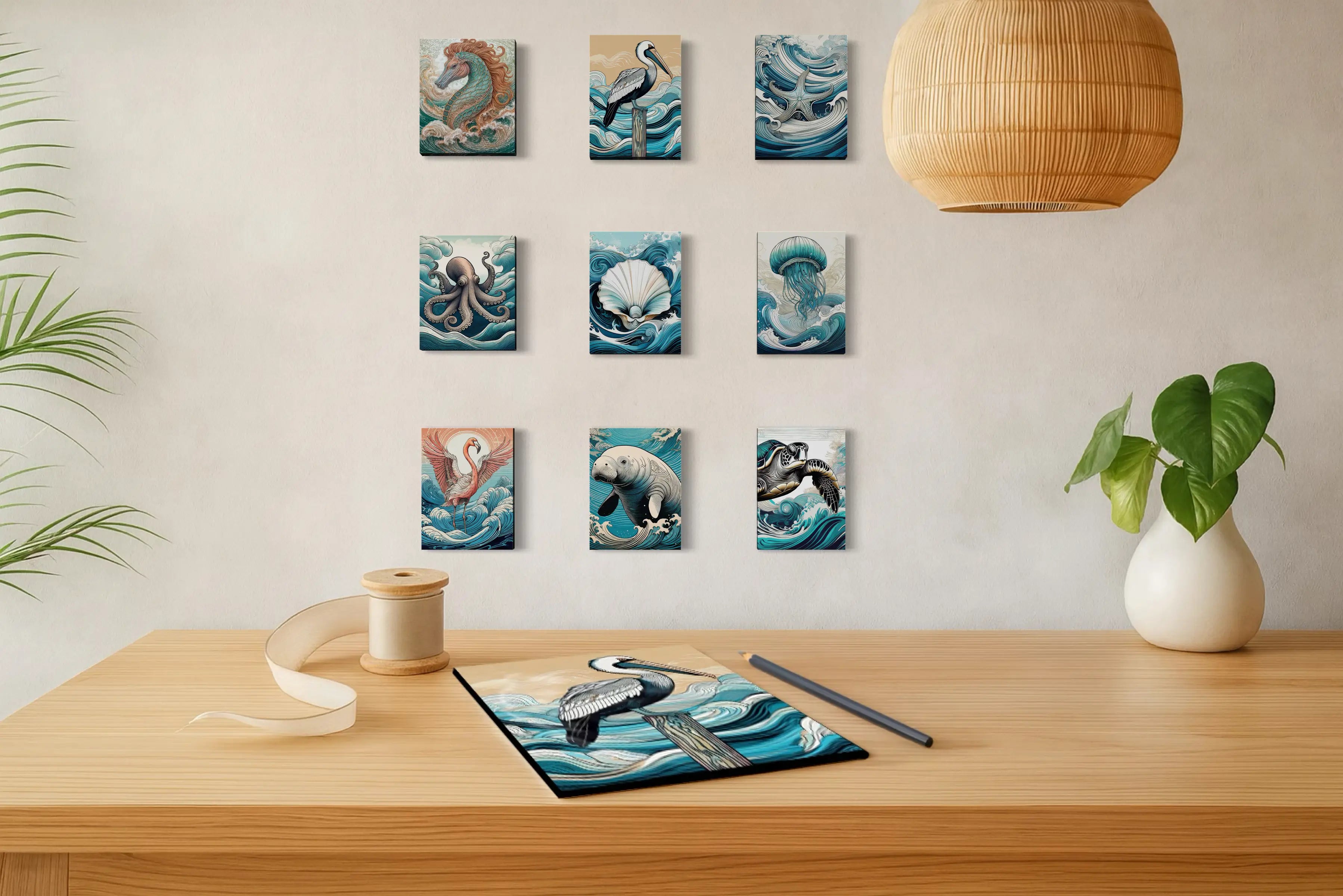
The examples below show several of the approaches discussed above—from single statement pieces and diptychs to triptychs and coordinated sets. Each one uses scale, repetition, and proportion a little differently, giving you a chance to see which kind of arrangement feels right for your own wall.
What is the difference between a diptych and a triptych?
A diptych consists of two related panels, while a triptych consists of three. Either format may use one continuous composition divided across the panels or separate coordinated artworks intended to be displayed together.
Is a triptych the same as 3 panel wall art?
In most decorating contexts, yes. “Triptych” is the traditional art term for a three-panel work, while “3 panel wall art” is the more common shopping phrase.
How far apart should triptych panels be?
For Echoes of the Sea continuous glass triptychs, I recommend approximately 1–1½ inches between panels, with 1 inch providing the strongest visual continuity.
How do you hang 3 panel wall art evenly?
Begin with the center panel and establish its height and center point first. Then measure equal distances outward for the left and right panels, maintaining consistent spacing and level top edges.
Can I use three separate prints instead of a triptych?
Yes. Three coordinated prints can create similar overall scale while allowing each artwork to remain independent. Shared color, subject, size, typography, background, or photographic style can connect the piece
How large should wall art be above a sofa?
As a general starting point, artwork or a complete multi-panel installation spanning approximately 60–75% of the sofa width often feels balanced. The proportions of the room and the artwork should also guide the final decision.
Is a triptych good above a sofa?
Yes. Triptychs work particularly well above sofas and sectionals because their horizontal format follows the width of the furniture and creates a strong focal point without requiring a traditional gallery wall.
What is 4 panel wall art called?
Four-panel artwork may be called a quadriptych, tetraptych, or polyptych. For most decorating and shopping purposes, “4 panel wall art” or “multi-panel wall art” is the clearest description.
About the Author
Lisa Reid is the photographer and creative force behind Echoes of the Sea LLC, where coastal photography, natural form, and thoughtful interior design come together in luminous glass wall art.
Her work is shaped by a fascination with the way coastal subjects interact with space—how a wave can carry movement across a wall, how repeating shells create rhythm, and how coral, sea urchins, and other marine forms can become sculptural focal points through scale, light, and reflection.
As her photography has expanded into diptychs, triptychs, coordinated print sets, and larger installations, Lisa has become especially interested in the relationship between artwork and the architecture around it. Through the Coastal Journal, she shares practical guidance on choosing, sizing, and displaying coastal art alongside the stories and natural forms that inspire the work.
At the heart of Echoes of the Sea is a simple idea: coastal art should do more than fill a wall. It should bring some of the peace, wonder, and connection we experience near the water into the spaces where we live.


