

Why Dark Backgrounds Work So Well in Coastal Wall Art
|
|
Time to read 7 min
Cart
Your cart is empty
|
|
Time to read 7 min
Most people expect coastal wall art to be pale, airy, and washed in soft light.
They picture driftwood neutrals, sea-glass greens, sky blues, and shoreline scenes that seem to dissolve gently into a room. That version of the coast is beautiful, and it will always have its place. But it is not the only way the coast can be seen.
Some of the most striking coastal imagery begins in shadow.
A dark background can make a shell feel sculptural instead of merely decorative. It can give a bird portrait more presence. It can sharpen the curve of a wave, deepen the contrast of pale feathers, and turn a familiar coastal subject into something more focused, more luminous, and more memorable. Rather than taking away calm, darkness can bring clarity.
That is part of what makes darker coastal wall art so compelling. It asks you to see the coast differently — not only as brightness and openness, but as form, contrast, depth, and quiet drama.
Table of contents
For years, coastal design has leaned toward softness.
White walls, sun-bleached wood, faded blue textiles, and art that feels easy, relaxed, and light-filled have shaped the visual language of the style. It is a look many people still love, and for good reason. But because it is so familiar, it can also make certain coastal subjects feel more predictable than they really are.
A shell against a pale background reads one way. A shell against black reads another. A heron against a misty marsh feels different from a heron emerging from shadow. A flamingo against soft sky is one kind of image; a flamingo set against charcoal becomes something far more intimate and deliberate.
That is the shift dark grounds create. They do not change the subject itself. They change how clearly we see it.
But there is also a growing pull toward coastal imagery with more contrast, depth, and visual richness — work that shows a darker, more sculptural side of the sea.
One of the strongest visual effects of a dark background is that it makes lighter forms appear more luminous.
Cream shells, white feathers, blush-pink plumage, soft blue-gray wings — all of these become sharper and more dimensional when placed against black or charcoal. Edges become cleaner. Negative space becomes more intentional. The artwork gains contrast, but not necessarily harshness.
This is why coastal wall art with darker grounds can feel so fresh. The coast is full of pale, reflective, delicate forms. On a dark field, those forms do not disappear into atmosphere. They stand forward. They glow.
Dark backgrounds do not make coastal art feel heavier; they often make it feel clearer.
That clarity is part of what gives these pieces such presence. Instead of asking the eye to take in an entire scene at once, they direct attention toward shape, detail, and light.
This is especially true with shell wall art.
Shells already carry a remarkable sense of architecture. Their spirals, ridges, chambers, and curves hold structure in a way that almost feels designed. Against a dark background, that structure becomes more visible. The shell stops reading only as a coastal object and begins to read more like natural sculpture.
This is one reason shell studies can feel so powerful in more modern interiors. Their geometry becomes more legible. Their pale tones become more luminous. Their quiet complexity has room to stand on its own.
A shell against shadow can feel almost museum-like — not because it is formal, but because it asks to be looked at closely. It invites attention to line, proportion, and form in a way that lighter scenic art often does not.
Dark grounds can do something equally compelling for birds.
In coastal bird wall art, a darker background often strengthens posture, gaze, and silhouette. The bird feels less like part of a passing scene and more like a subject with real presence. A pelican set against black becomes calmer and more dignified. A heron portrait feels more focused and architectural. A flamingo, with its blush and ivory tones, takes on warmth and contrast that would be less pronounced in a softer setting.
This is part of why bird portraits can feel so personal on the wall. They do not only depict wildlife. They hold expression, stillness, alertness, and character. Dark backgrounds make those qualities easier to see.
They also help coastal bird imagery feel less expected. Instead of reading as casual seaside décor, the work can feel more deliberate, collected, and visually resolved.
There is often an assumption that darker coastal wall art must feel dramatic in a loud or heavy way.
But darkness and calm are not opposites.
A black ground can be quiet. Charcoal can be restrained. Contrast can be meditative when the subject itself carries balance and stillness. A pale shell on black does not feel frantic. A white pelican against shadow does not feel chaotic. A flamingo emerging from a dark field can feel more serene, not less.
What matters is the relationship between the subject and the background. If the form is elegant, the palette controlled, and the composition intentional, a darker piece can feel every bit as calming as a pale shoreline scene — while offering more contrast and definition.
That is one of the misunderstandings this kind of work often has to overcome. Darker coastal art is not the opposite of peace. It is simply another expression of it.
Dark backgrounds also help coastal wall art feel more contemporary.
Part of that comes from contrast. Part comes from restraint. But much of it comes from the way dark grounds simplify the image and make it more graphic. They remove visual noise. They isolate form. They allow a shell, bird, or wave to function less like theme and more like composition.
That is often what separates art that feels decorative from art that feels considered.
A dark-ground shell study can feel architectural. A bird portrait can feel editorial. A close crop can feel more curated than a wide scenic view. The coast is still there, but it is being presented through shape, line, and visual intelligence rather than only through atmosphere.
That is what makes these pieces memorable. They do not ask to disappear into a room. They ask to be noticed for the way they are made.
The coast is not only bright.
It is also shadow at the edge of a shell. A bird emerging from dusk. A pale feather against deep water. A still life that feels almost sculptural because darkness has made its contours visible.
That is the side of the shore dark backgrounds reveal.
For those drawn to coastal wall art that feels more distinctive, more luminous, and a little less expected, dark-ground pieces offer something unusually strong: not just contrast, but concentration. They let the coast appear with more edge, more presence, and often more beauty than we first assume.
And that may be part of why they stay with us. They do not soften the coast into sameness. They let it keep some of its mystery.
If you want to see how reflective materials deepen that sense of contrast and clarity, visit Why Glass.
If you are drawn to the darker, more sculptural side of the shoreline, you may also enjoy Coastal Noir Décor and Moody Coastal Living Room Ideas.
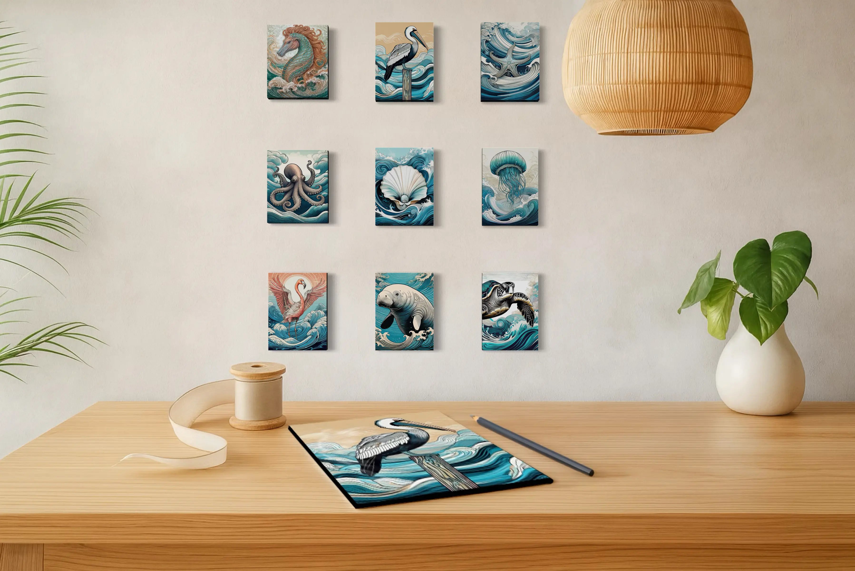
These shell studies and bird portraits show how darker grounds can make coastal forms feel more luminous, sculptural, and distinct.
If this darker, more contrast-rich side of the coast speaks to you, explore the full collection of coastal prints shaped by shadow, depth, and luminous detail.
Dark backgrounds create contrast, which helps shells, birds, and other coastal subjects appear sharper, more luminous, and more sculptural. They can make coastal wall art feel more modern and visually distinctive without losing its calm.
Not necessarily. Dark coastal wall art can still feel serene when the subject, palette, and composition are balanced. A pale shell, bird, or wave against black or charcoal often feels clearer and more refined rather than heavy.
Shell studies, bird portraits, and close-cropped coastal details often work especially well on dark backgrounds. The contrast helps reveal structure, silhouette, and finer detail in a way lighter backgrounds sometimes soften.
Shells already have strong natural architecture through their spirals, ridges, and curves. A dark ground isolates those forms and makes their structure more visible, which gives shell wall art a more sculptural and collected presence.
Yes. Coastal art does not have to be pale to feel connected to the sea. Dark-background coastal wall art offers a more contrast-rich, luminous, and contemporary interpretation of coastal subjects while still feeling rooted in shoreline imagery.
Dark backgrounds give bird portraits more presence by sharpening posture, gaze, and silhouette. In coastal bird wall art, this often makes pelicans, herons, and flamingos feel more focused, portrait-like, and memorable.
About the Author
Lisa Reid is the photographer and founder behind Echoes of the Sea, where she creates coastal glass wall art inspired by the structure, symbolism, and shifting light of the shoreline. Her work is shaped by time spent observing shells, birds, waves, and coastal landscapes with an eye for the quieter details that give the sea its lasting presence.


