

Coastal Design Myth Busting: What Actually Works in Real Rooms
|
|
Time to read 9 min
Cart
Your cart is empty
|
|
Time to read 9 min
Coastal rooms do not have to stay pale to feel calm. Contrast can make them feel more finished.
Table of contents
Some design myths linger because they sound sensible.
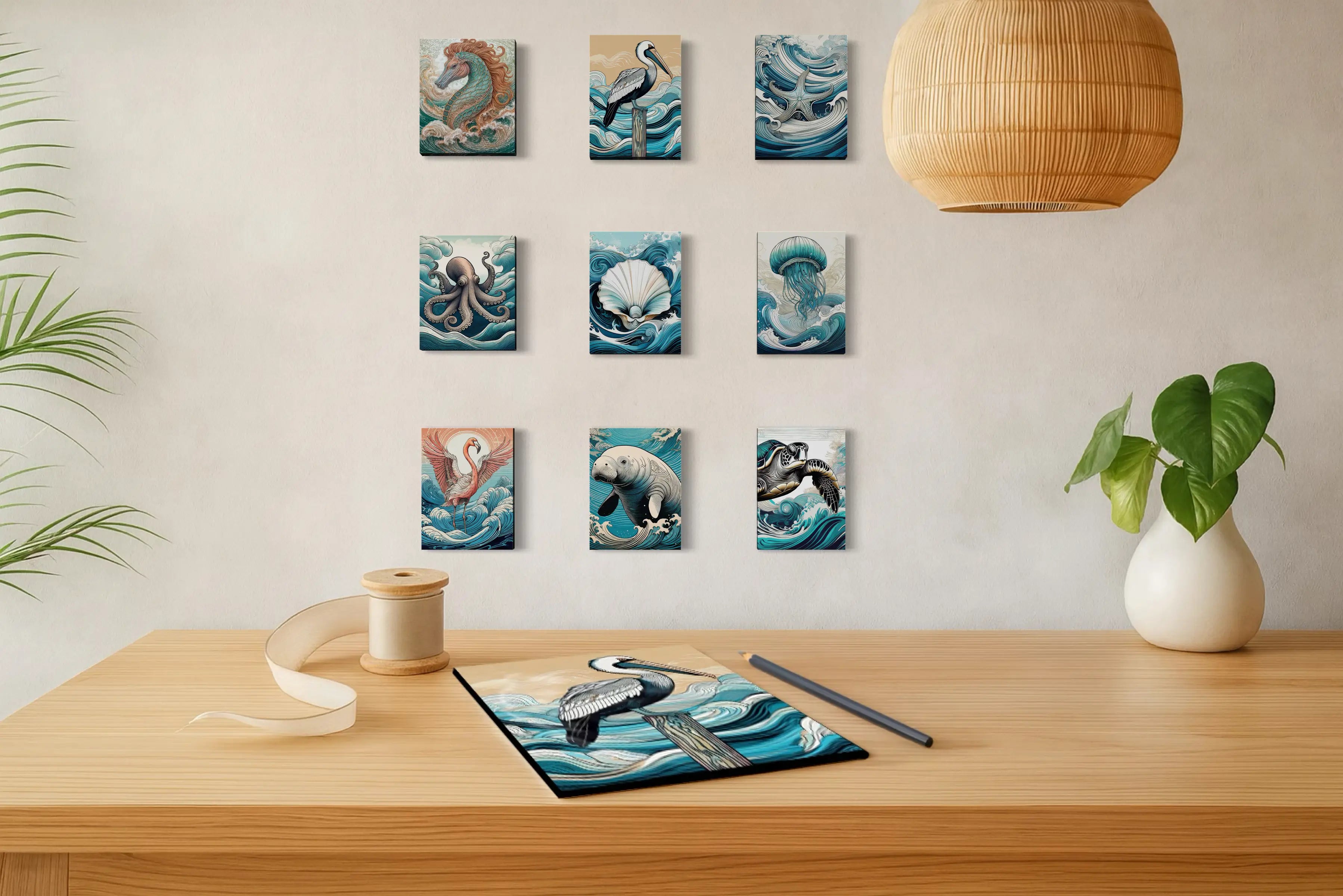
Keep the art small in a small room. Coastal interiors should stay pale and airy. Dark pieces feel too heavy. A grouping has to match to feel balanced. A gallery wall is always better than one statement piece.
The problem is that many of those ideas are only half true.
In real homes, what works depends less on rules and more on proportion, contrast, light, rhythm, and the feeling a room actually needs to hold. That is especially true with coastal wall art, which is why thoughtful coastal design myth busting matters more than repeating the same safe advice.
It usually is not.
Some of the most memorable coastal interiors use oversized art in smaller spaces, darker pieces in bright rooms, mixed-format groupings, and one strong print where a gallery wall would only create noise. The best rooms are not built by following decorating clichés too literally. They are shaped by choosing art with more intention.
Here are a few of the most common coastal design myths — and what actually works instead.
This is one of the most common decorating assumptions, and one of the most misleading.
People often think a small room needs small art so the space does not feel crowded. In reality, undersized art is often what makes a room feel unfinished. A piece that is too small can look hesitant on the wall, especially if the furniture beneath it has more visual presence than the artwork above it.
In many cases, one larger piece creates more calm than several smaller ones.
That is because a well-scaled statement print simplifies the room. It gives the eye one place to land. It creates structure. It keeps the space from feeling scattered.
This is especially true in entryways, powder rooms, hallway walls, and smaller sitting areas where a room does not need more objects. It needs one strong decision.
With glass wall art, scale can feel especially effective because glass reads visually lighter than canvas. It can hold presence without feeling bulky or heavy.
What actually works:
The best size is not the one that feels safest. It is the one that feels proportional to the wall, the furniture, and the visual weight of the room.
This is one of the biggest coastal misconceptions.
Many people still think coastal means pale, breezy, and washed in white. That look can be beautiful. But it is not the only way a coastal room can feel light.
Dark coastal art can bring depth, contrast, and polish in a way softer pieces sometimes cannot.
A pelican portrait on a dark ground, a shell study with strong contrast, or a dramatic coral piece can make a bright coastal room feel more finished rather than less coastal. In fact, contrast is often what keeps a coastal interior from drifting into sameness.
Dark art does not cancel the lightness of a room. It gives the light something to play against.
That is part of why deeper, darker prints can work so beautifully in coastal living rooms, entryways, offices, and bedrooms. They add shape, structure, and confidence while still staying rooted in the forms and rhythms of the sea.
What actually works:
If the subject still belongs to the coast, darker art can make a coastal interior feel more refined, more memorable, and more complete.
This one keeps a lot of people playing it too safe.
A grouping does not have to be perfectly matched to feel intentional. It does not have to use the same orientation, the same background color, or the same exact mood across every piece. What it needs is relationship.
That relationship might come through subject matter, palette, rhythm, spacing, contrast, or the way the pieces speak to one another on the wall.
A vertical black-background piece with two lighter horizontal prints on either side can feel more dynamic than three identical frames ever would. A stacked arrangement can create lift. A mixed grouping can feel more collected, more editorial, and more alive.
The mistake is not variation. The mistake is choosing pieces that have no meaningful conversation with one another.
A room can hold contrast and still feel cohesive. In fact, that is often what makes a grouping beautiful.
What actually works:
Balance comes from connection, not perfect matching.
Gallery walls are popular for a reason. They can feel layered, personal, and collected. But they are not automatically the best answer.
Sometimes one strong piece does more for a room than five smaller ones.
A single statement print often creates more clarity, more calm, and a stronger focal point than a busy arrangement. That is especially true in smaller entryways, compact bedrooms, powder rooms, and walls that do not have enough room to breathe.
A gallery wall works best when the space can support it — visually and physically. It should feel curated, not crowded.
One print, on the other hand, can give a room immediate confidence. It tells the eye exactly where to go. It gives the wall presence without requiring explanation.
This is one of the most useful distinctions when choosing between a coastal gallery wall and a statement piece: not every blank wall wants a collection. Some walls want one clear point of view.
What actually works:
Choose a gallery wall when the room wants layering. Choose one statement piece when the room wants clarity.
This is one of the assumptions that makes the most coastal rooms start to look alike.
Yes, dune paths, pale horizons, shells, and soft shoreline scenes can be beautiful. But coastal art does not have to stay literal, quiet, or predictable to belong in a room inspired by the sea.
A flamingo can bring a warm pulse of color to a soft interior, while a jellyfish or shell study can add glow, contrast, or quiet drama — especially in spaces like living rooms where the artwork helps define the mood. A dramatic shell study can make a room feel more collected. A stylized wave piece can bring energy into an otherwise still space.
The best modern coastal wall art does not just match the room. It gives the room something to feel.
Sometimes that feeling is calm. Sometimes it is contrast. Sometimes it is lift, glow, warmth, or a little more life.
That is why choosing art only by palette is often too narrow. Subject, composition, contrast, and emotional tone matter just as much.
What actually works:
The best coastal art does not have to stay pale, literal, or easy to match. It only has to give the room the feeling it is missing.
If there is one thread running through all of these myths, it is this: good rooms are not built by following decorating rules too literally.
They are built by asking better questions.
That is the kind of thinking that leads to better rooms — and better art decisions.
That is where coastal art becomes more than decoration. It becomes direction.
If you are gathering ideas for how color, scale, contrast, and subject can shape a room, our broader collection of coastal design ideas explores more ways to create a home that feels layered, calm, and personal.
A dune-path or shoreline print can make a room feel open, airy, and restorative.
A shell-and-orchid study can make an entryway feel warm, gracious, and quietly welcoming.
A pelican portrait or dark-ground shell study can give a coastal room more polish and contrast.
A flamingo can wake up a calm neutral room without turning it chaotic.
A jellyfish print can carry a wall on its own, bringing glow, motion, and a stronger focal presence than a busier arrangement might.
A mixed grouping of coastal studies can make a wall feel more collected and architectural than a perfectly matched set ever would.
If you are starting to recognize what your room is missing — more calm, more contrast, more glow, or more presence — the featured pieces below offer a place to begin.
Yes. Large wall art can actually make a small room feel more resolved and less cluttered than several smaller pieces. The real issue is proportion, not size alone.
Yes. Dark coastal art can add contrast, depth, and polish while still feeling rooted in the sea. Coastal interiors do not have to stay pale to feel coastal.
No. A grouping can feel balanced through subject, palette, rhythm, spacing, or contrast. It does not have to be perfectly matched to feel intentional.
Sometimes. A gallery wall works well when the room wants layering and visual texture. One statement piece often works better when the room needs clarity and a stronger focal point.
No. The best coastal art often shapes the feeling of the room rather than simply matching its color palette.
Some of the most beautiful interiors feel the way they do because someone was willing to ignore a decorating assumption that was never especially helpful to begin with.
That is true of scale. It is true of contrast. It is true of grouping. And it is especially true of coastal design.
The right print does not have to be the safest one. It has to be the one that gives the room what it needs.
The right piece does not have to be the safest one. It has to be the one that changes the room in the way you need. Explore the collection to find coastal glass wall art that brings calm, contrast, glow, structure, or a more memorable point of view into your space.
About the Author
Lisa Reid is the photographer and founder behind Echoes of the Sea LLC, where she creates coastal glass wall art designed to bring atmosphere, light, movement, and emotional presence into the home. Her work is inspired by the shoreline, marine life, shells, coastal botanicals, and the changing rhythm of the sea.


